
Graphic Design |
|
Dentist Exam Room Redesign
|
|
|
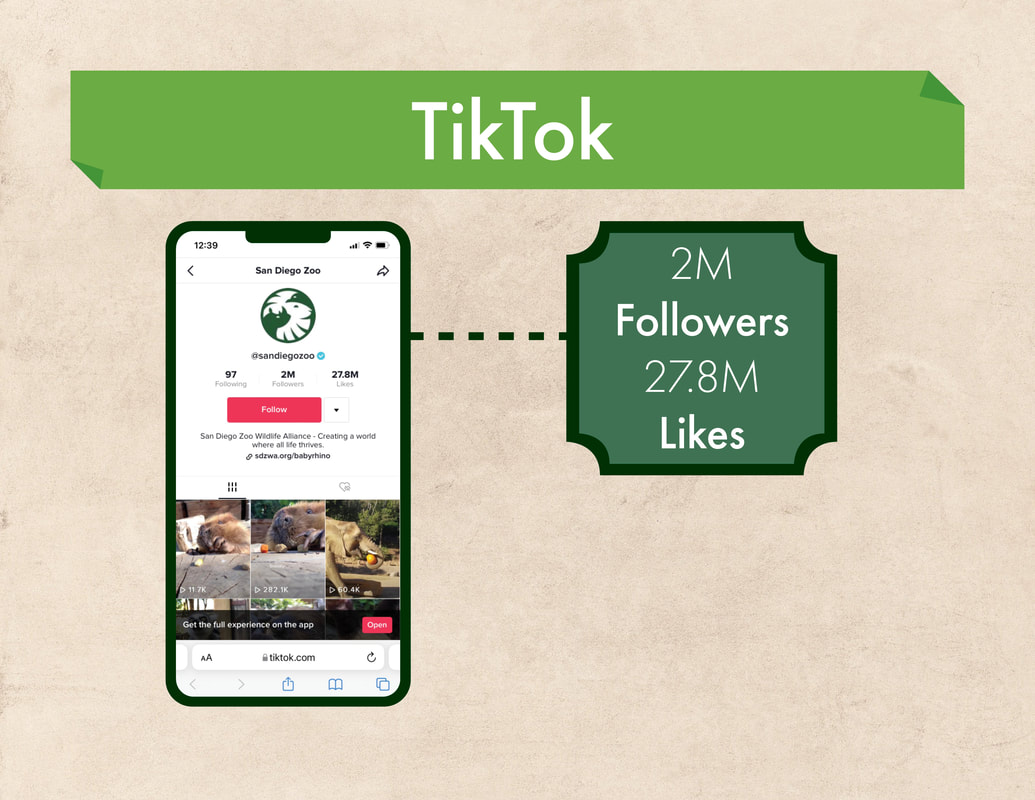
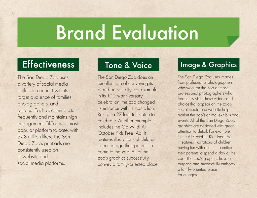
The final design fulfills the goals of Smilecraft Interiors and Caruso Family Dentistry by creating an inviting and calming environment that aligns with the client's business goals. Incorporating plant life, a fish tank, and cool colors contribute to the overall soothing ambiance of the space. These elements help to alleviate patient anxiety and create a more relaxed atmosphere during dental visits. It relied on all original creative strategies, with careful attention to detail and planning from initial overlays to ensure high-quality work in a fast-paced environment.
The use of hardwood floors adds a touch of warmth and sophistication to the room, showcasing the design's attention to detail and quality. The 411 square foot size of the room demonstrates how the space can be effectively utilized, providing ample room for patient comfort and movement.
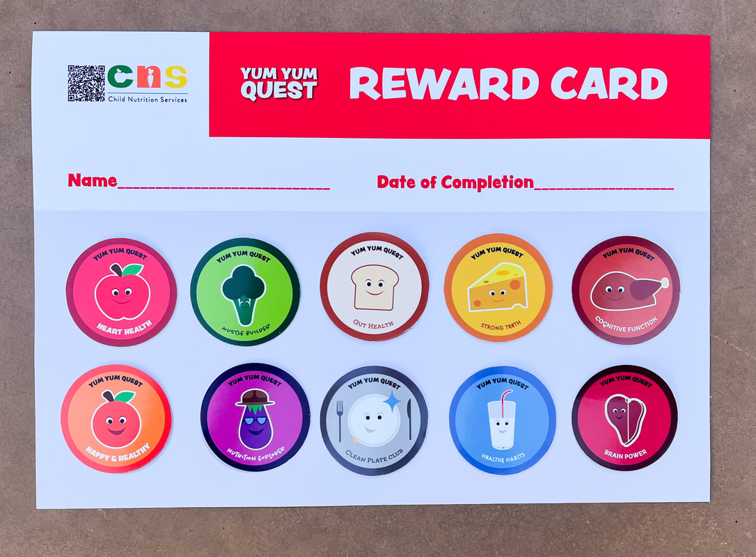
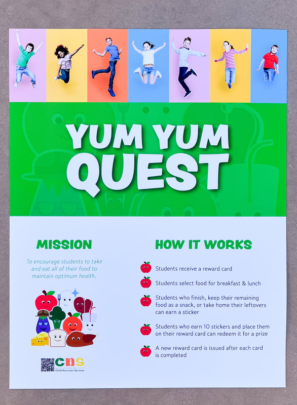
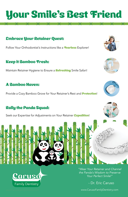
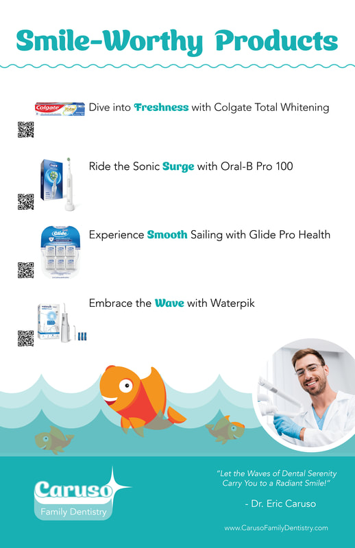
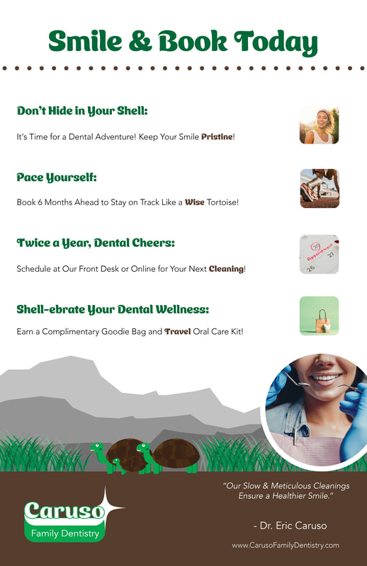
The fun animal-themed informational posters add visual interest to the space and serve as educational tools for patients. These posters communicate important dental information engagingly and memorably, catering to the audience's needs for informative yet visually appealing materials.
Overall, the final design fulfills the project's objectives of creating an inviting dentistry with a calming theme, informing patients about top dental products, reminding them to book appointments, and educating them about the importance of wearing a retainer. It successfully addresses the client's business goals of enhancing the patient experience, establishing awareness about Caruso Family Dentistry, and promoting Smilecraft Interiors' expertise in dental interior design.
By fulfilling these goals, the final design not only meets the project's objectives but also caters to the target audience's needs, which includes dental professionals seeking to enhance their clinic's interior design and create a positive patient experience. The design creates a space that resonates with patients, promotes well-being, and fosters a positive association with dental visits.
The use of hardwood floors adds a touch of warmth and sophistication to the room, showcasing the design's attention to detail and quality. The 411 square foot size of the room demonstrates how the space can be effectively utilized, providing ample room for patient comfort and movement.
The fun animal-themed informational posters add visual interest to the space and serve as educational tools for patients. These posters communicate important dental information engagingly and memorably, catering to the audience's needs for informative yet visually appealing materials.
Overall, the final design fulfills the project's objectives of creating an inviting dentistry with a calming theme, informing patients about top dental products, reminding them to book appointments, and educating them about the importance of wearing a retainer. It successfully addresses the client's business goals of enhancing the patient experience, establishing awareness about Caruso Family Dentistry, and promoting Smilecraft Interiors' expertise in dental interior design.
By fulfilling these goals, the final design not only meets the project's objectives but also caters to the target audience's needs, which includes dental professionals seeking to enhance their clinic's interior design and create a positive patient experience. The design creates a space that resonates with patients, promotes well-being, and fosters a positive association with dental visits.
EVACU MATE - Evacuation Kit
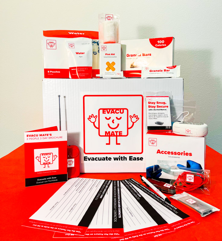
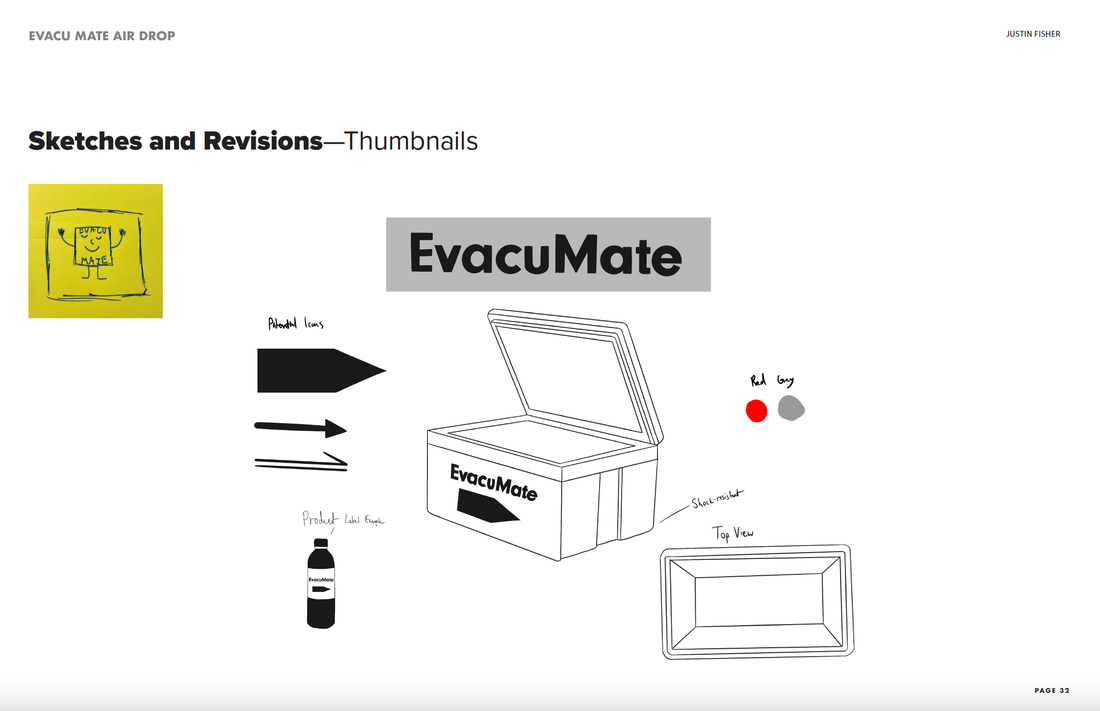
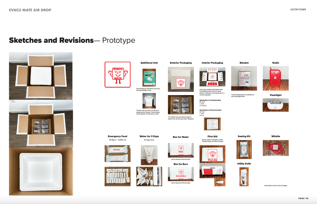
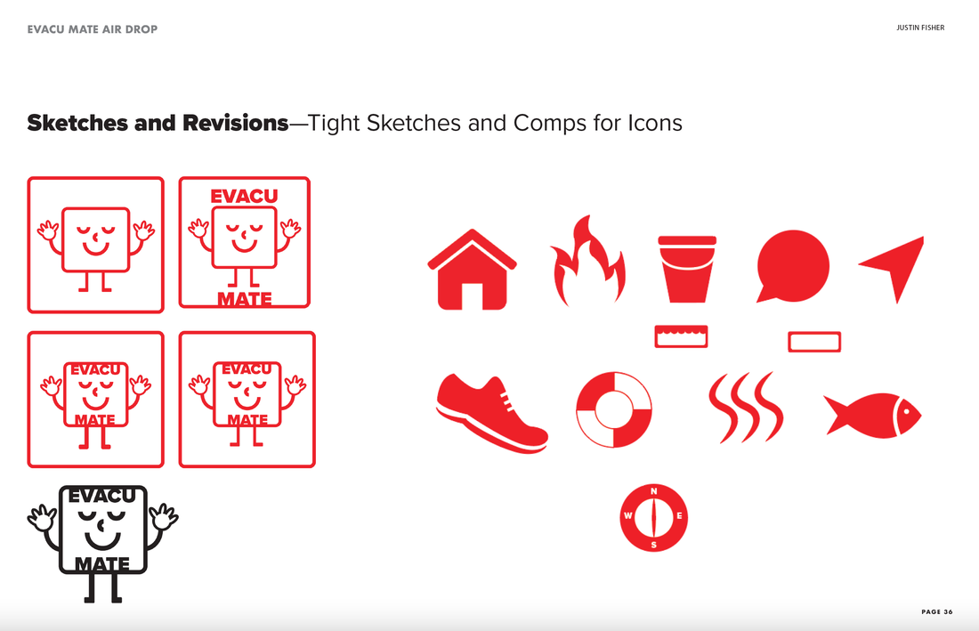
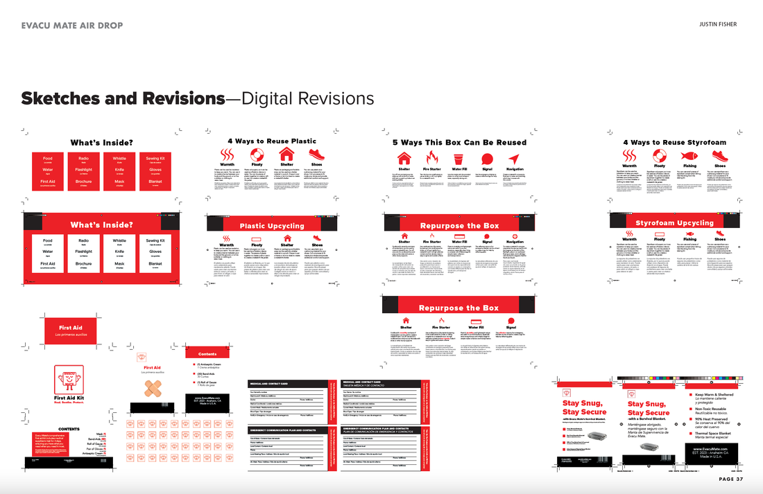
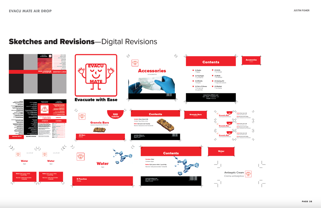
Evacu Mate’s primary focus is to produce reliable and durable evacuation kits. The company’s manufacturing warehouse, located at 1234 S Harbor Blvd, Anaheim, CA 92805, is acquiring materials and constructing a production facility to manufacture these kits. The first survival kit produced by Evacu Mate will be accessible, functional, and intuitive, featuring bilingual information and intuitive icons. It will provide clear instructions on how to use it effectively during a disaster and be able to withstand a second-story drop without any damage. The objective is to create a dependable, long-lasting, and reasonably priced evacuation kit that can meet the needs of two adults for up
to three days. After releasing the first Evacu Mate kit, the company plans to evaluate its success and develop an updated evacuation kit within six months. The company is looking for a graphic designer to create the first evacuation kit model on a limited budget of $10. The kit should include emergency food and water for two adults, an emergency blanket, gloves, a mask, a small first aid kit, and a bilingual information card/booklet with disaster kit instructions and post-disaster guidelines. The primary stakeholders of Evacu Mate are its staff, shareholders, investors, suppliers, distributors, government, board of directors, and administration. The primary target audience for the initial product launch is two adults in a survival situation for three days. Evacu Mate’s brand style guide features Proxima Nova Black for the headlines and Avenir Light for the body copy, while Avenir Light Oblique is used for Spanish translations. The headlines are all in English to avoid cluttering the type, while the Spanish translations are placed immediately below the English. The color palette, which includes red, white, and black, was inspired by the Red Cross’s iconic color scheme. These colors were chosen to stand out and alert users to the emergency nature of the products. Evacu Mate’s logo is designed to add a touch of fun and personality to the brand while promoting a sense of calmness in emergencies. The logo is a playful representation of the Evacu Mate design, which aims to alleviate user anxiety. Additionally, the icons used for the sections to repurpose the materials are simple, universally understood vector images. The icons come with accompanying translations for Spanish-speaking users. The product packaging for the water granola bars contains rationing information, which helps users make their supplies last for three days. The packaging for first aid and accessories lists the name and quantity of each item clearly. The tops of each package are also labeled for ease of use. These design choices ensure that users can quickly and easily access the necessary items during an emergency. Evacu Mate is a brand that emphasizes accessibility, convenience, and sustainability. Its bilingual and environmentally-friendly products are designed to be reusable, reflecting the company’s commitment to minimizing waste. The brand promises to provide all the necessary resources for sustenance and well-being during emergencies. Evacu Mate’s mission is to provide peace of mind to individuals during times of crisis by offering a comprehensive kit that contains all the essential items for survival. The brand aims to make evacuation easy and stress-free by ensuring customers have the necessary supplies to evacuate quickly and efficiently. When users receive their Evacu Mate, they should feel reassured and confident in their emergency preparedness. The bilingual feature and clearly labeled packaging are designed to help them effectively manage any emergency. The prototype of Evacu Mate’s first evacuation kit is a compelling showcase of the company’s design and versatility. Opening the velcro sides reveals helpful tips on how to reuse styrofoam, plastic, and the box itself, while the interior contains all the essentials with professional packaging. Moreover, the bilingual kit meets low vision standards to ensure accessibility. The kit can also withstand a two-story drop without the contents being dispersed and damaged. Customers are encouraged to visit www.EvacuMate.com to learn more about the company’s “Be Prepared” initiative and the Children’s Hospital of Orange County Toy Drive. The box design reflects the objective of creating a simplified and accessible emergency kit. All images are converted to CMYK with appropriate layers and paragraph styles formed for all the text. An organized grid, baseline grid, and column system also allow mass production. The final design of the Evacu Mate relied on all original creative strategies, with careful attention to detail and planning from initial overlays to ensure high-quality work in a fast-paced environment. With the Evacu Mate, customers will feel more prepared for an emergency. |
|
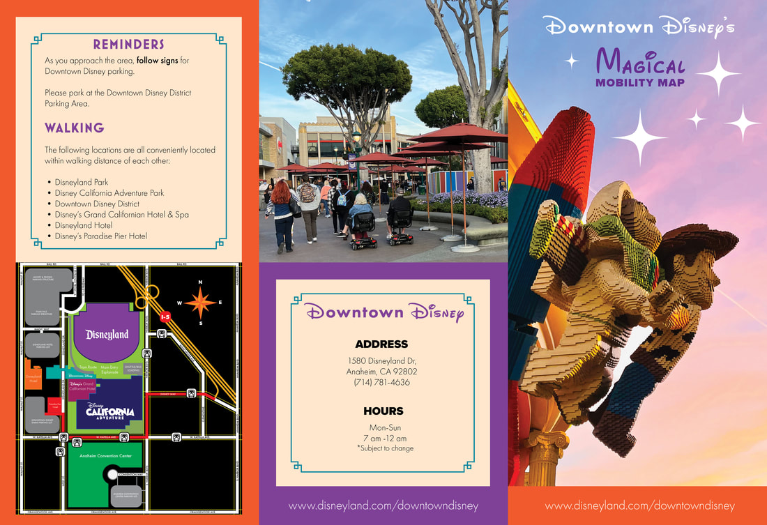
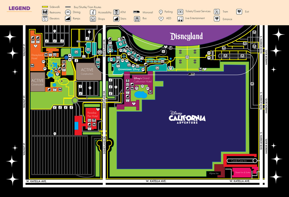
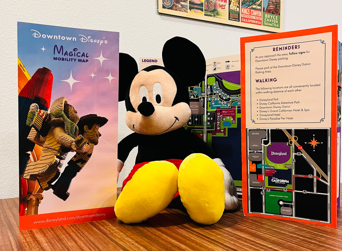
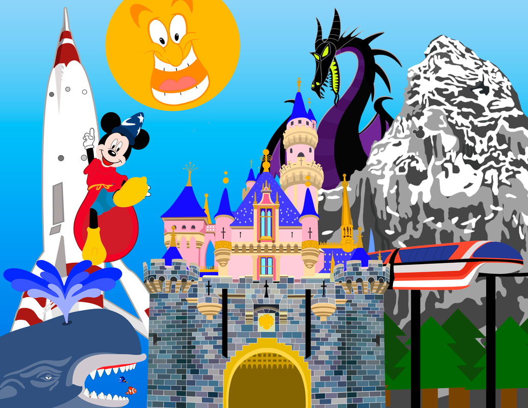
Downtown Disney's Magical Mobility Map
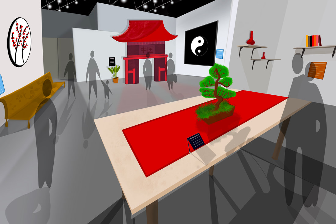
Guggenheim Gallery Exhibition Design
Fisher College Mascot Design & Catalog
|
Fisher College is the place where students can find balance as student-athletes and personalized education across all fields of study. Fisher College will prepare its students to be the cutting-edge leaders of tomorrow. Following their Fisher College experience, students are expected to leave with the knowledge and expertise to change the world.
After reading the catalog, the viewer will understand Fisher College and its core principles of “grit, integrity, perseverance and determination.” The viewer will be inspired to achieve their dreams and apply to Fisher College. If inclined, the viewer will purchase merchandise to support the school’s efforts in cleaning the ocean. The mascot’s bold and timeless design will resonate with future generations of students. |
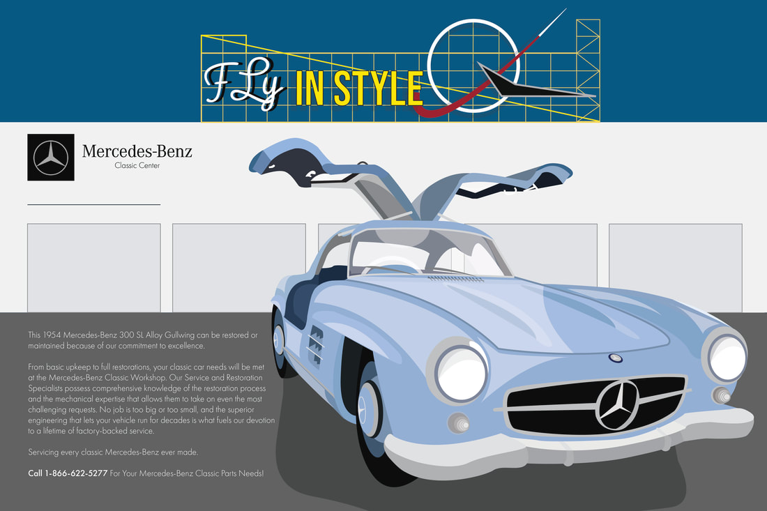
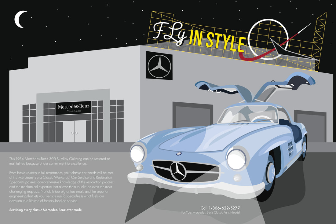
Mercedes-Benz Classic Center Art Deco Poster
|
|
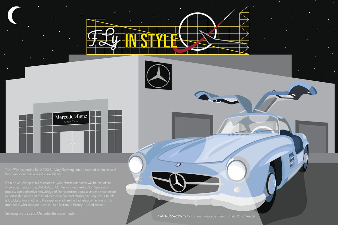
Night has fallen at the Mercedes-Benz Classic Center! This design features the 1954 Mercedes-Benz 300 SL Alloy Gullwing in blue. It comes in nine other colors. The car is drawn in simple shapes to reflect the art deco style. A reference photo was taken from the center to capture the Gullwing accurately. It is the same color and model displayed at the entrance of the Mercedes-Benz Classic Center. Behind the vehicle is the new state-of-the-art facility in Long Beach, CA. It features three garage doors, the entrance to the center, and a color palette of grays and blacks to make the vehicle the focal point. When visiting the Mercedes-Benz Classic Center, one first notices the “Fly DC JETS” industrial sign on the building. Here, the signage is reimagined with the headline “Fly IN STYLE” to pay homage to Mercedes-Benz’s aviation history. It also references the wings of the Gullwing. To provide contrast, the metal sign is yellow against the starry night sky. The circular emblem is white, and the roaring rocket is red for additional contrast. The crescent moon in the top left corner creates balance with the sign. In an art deco style, two distinct fonts are used in the headline.“Fly” is in the Pacifico font with “IN STYLE” as Bebas Neue. These fonts closely resemble the original letter designs in the official sign. The vehicle’s headlights in Light Futura font illuminate the body copy and phone number. Futura font matches the art deco period with its simple and modern style. It complements the Mercedes-Benz branding typography as a sans serif font. All fonts, except the sign, are aligned with the building and vehicle to create a modern-looking composition. When looking at the visual hierarchy, the viewer will first see the headline, followed by the Gullwing, the body copy and the phone number.
Bodega Norton Wine Advertisement
|
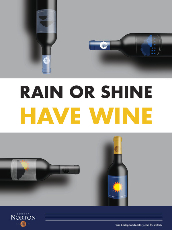
This advertisement for Bodega Norton Wine features icons of the weather. Whether it’s sweater weather or a day spent in the sun, wine is always the perfect beverage.
The wine bottles are arranged in an abstract format to create a visually compelling advertisement. This wine collection is a unified set with the same shape and color of glass. The headline “Rain or Shine Have Wine” rhymes and is strategically placed in the middle of the gap between the bottles. Each wine bottle has its own colored top with a specialized Bodega Norton emblem. Shadows and glares on the bottles are included to make the advertisement realistic. Even the label has a paper texture. The tips of the sun and cloud bottles line up with the “I” in “Rain” and “Wine” from the headline. The bottom section features the Bodega Norton Logo in a blue box with the body copy and Bodega Norton’s website as the call to action. Futura is a modern font that matches the tone of the advertisement. When the photographer recreates the advertisement, it will be in a studio setup with a gray backdrop. The wine bottles will be laid down with professional lighting equipment. |
|
The Tempest Theatre Poster
|
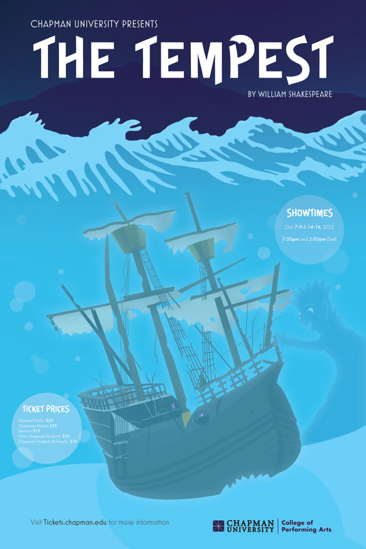
The final poster design for The Tempest captures the thrilling opening shipwreck scene. On the ship, one can find Caliban peaking through a porthole with Prospero’s staff and magic book on the deck. But be warned, Ariel is in the midst of destroying the ship! In the distance, the island awaits the crew’s arrival.
The nautical typography combination of Mostra Nuova (subheading), Delittle Chromatic (headline) and Futura (body copy) work thematically to inform the viewer. Chapman University’s College of Performing Arts logo is recolored in dark blue to ensure the viewer’s attention remains on the shipwreck. The poster, as a whole, uses hues of blue and purple to capture the feeling of the ocean. Bubbles with low opacity are purposefully placed across from each other with the showtime and ticket prices to guide the viewer’s eyes from top to bottom. |
Letter Visualization

|

|

|

|

|

|

|

|

|

|

|

|

|
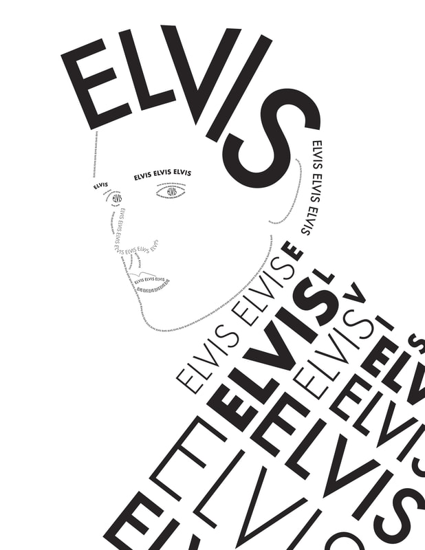
I learned about 13 different typography styles and recreated each letter using an 8”x8” grid on Procreate.
ELVIS Typography Portrait
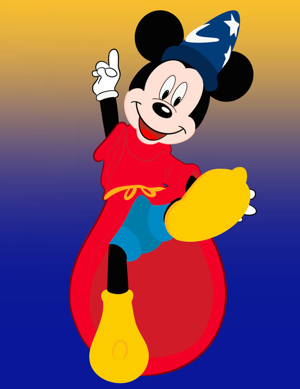
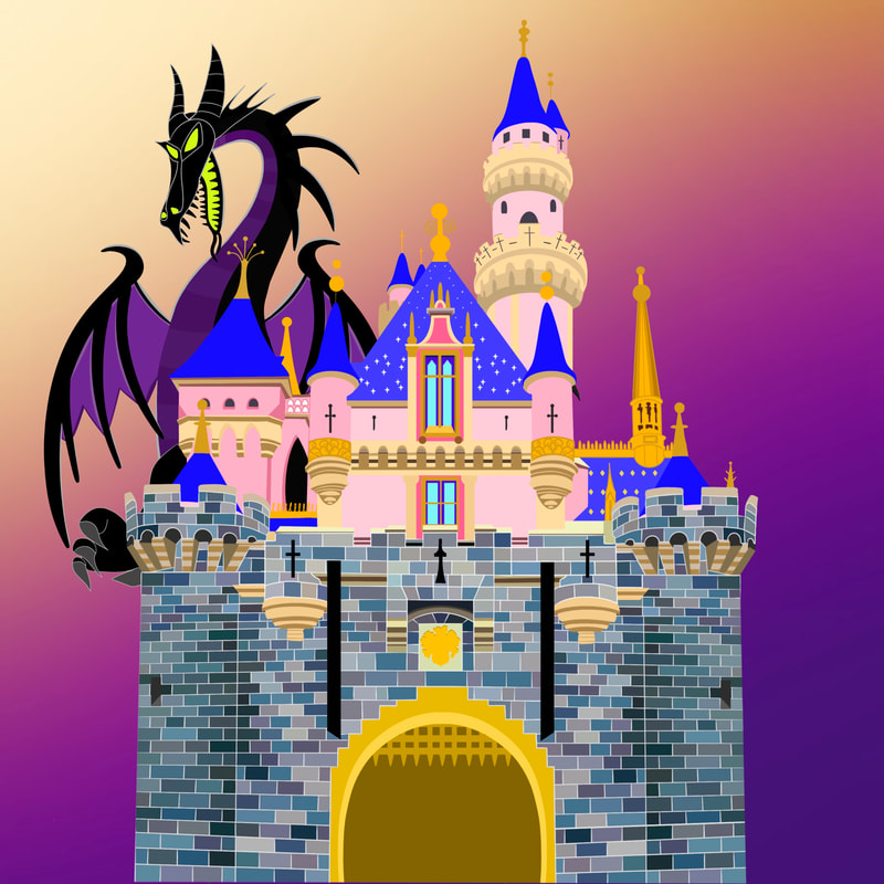
Disney Inspired Fan Art


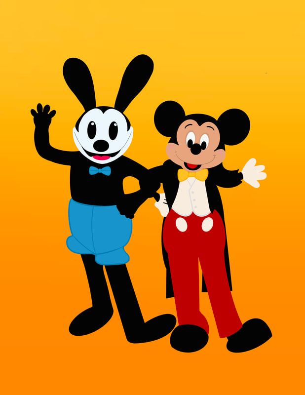


Dapper Day 2022
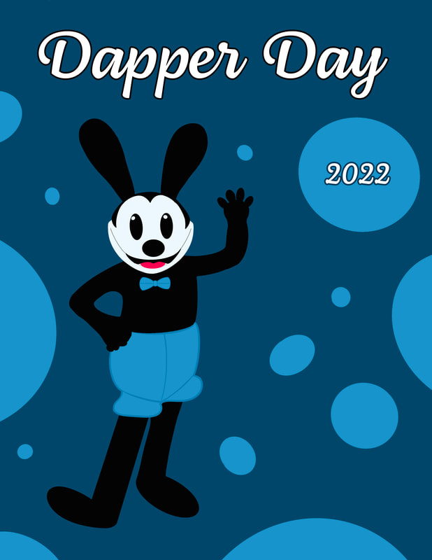
Featuring Oswald the Lucky Rabbit & Mickey Mouse
Design Strategy Portfolio
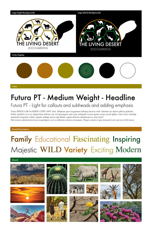
Theoretical Rebrand Project - The Living Desert
Logo Presentation
|
|
|
The Living Desert Brand Style Guide
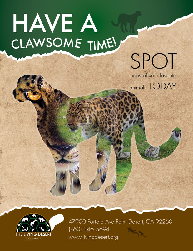
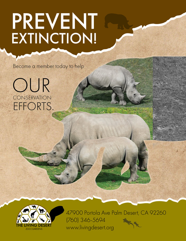
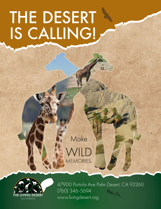
The Living Desert Advertisements
|
|
|
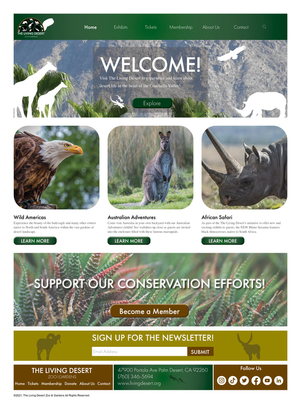
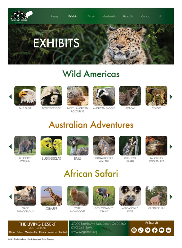
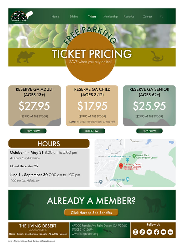
The Living Desert Website Design
|
|
|
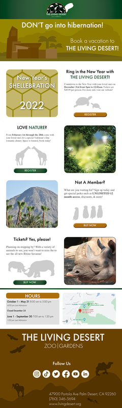
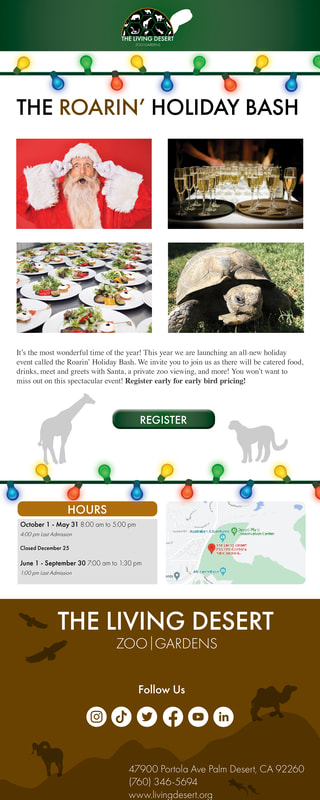
The Living Desert eNewsletter & Promotional Email
|
|
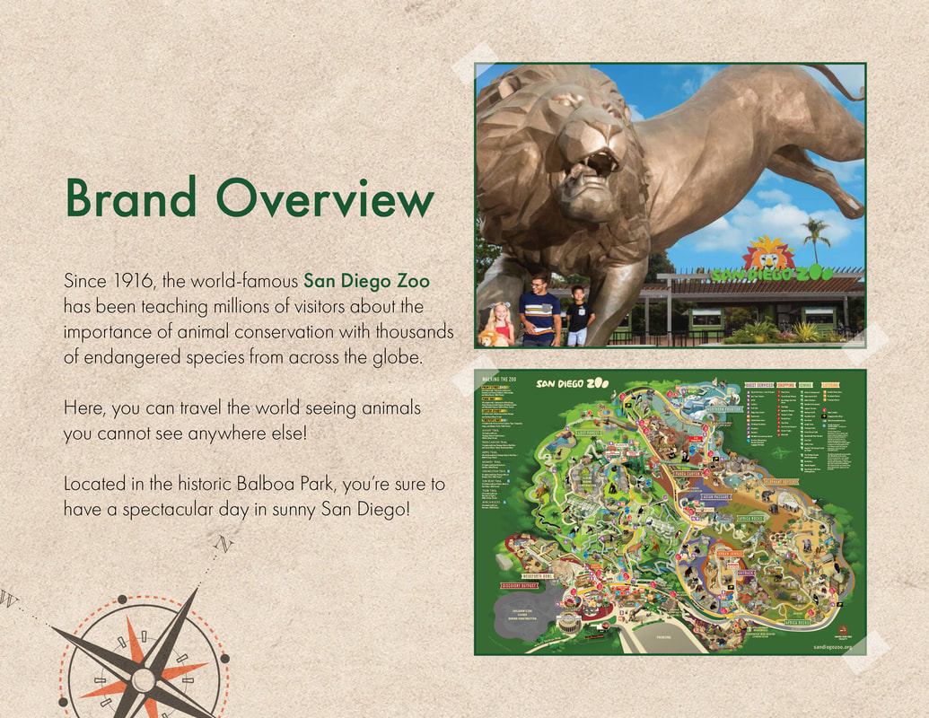
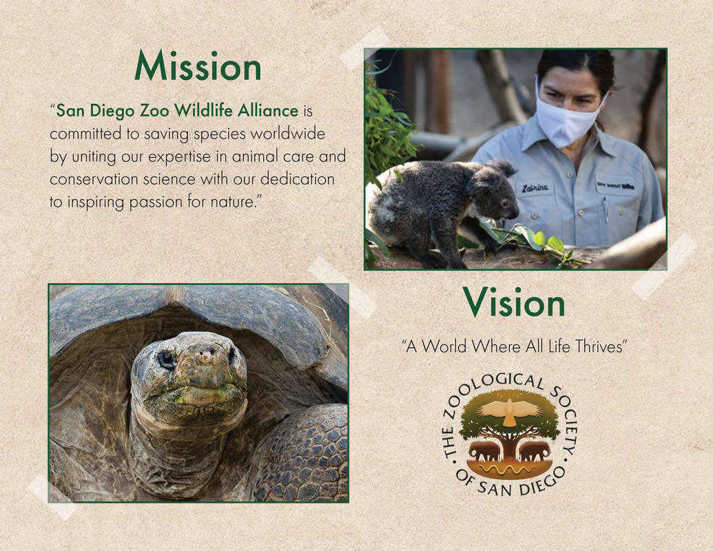
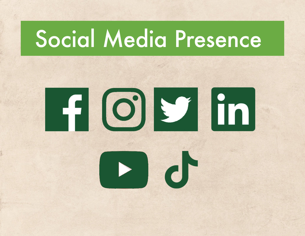
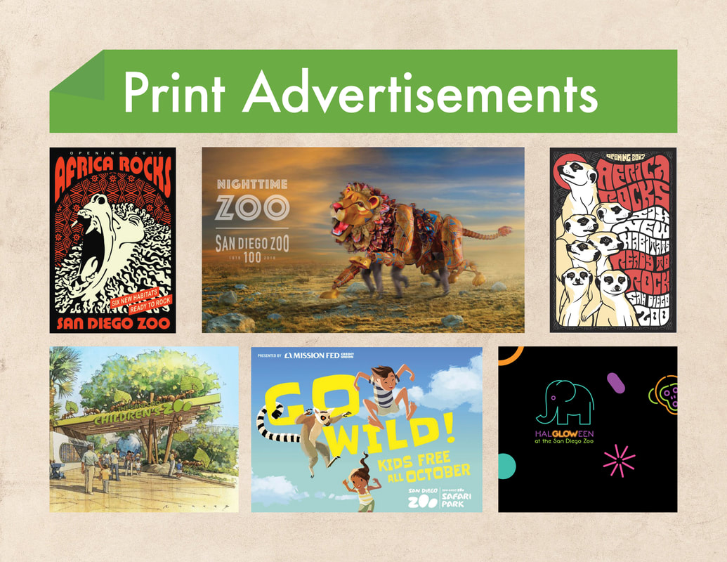
San Diego Zoo Presentation
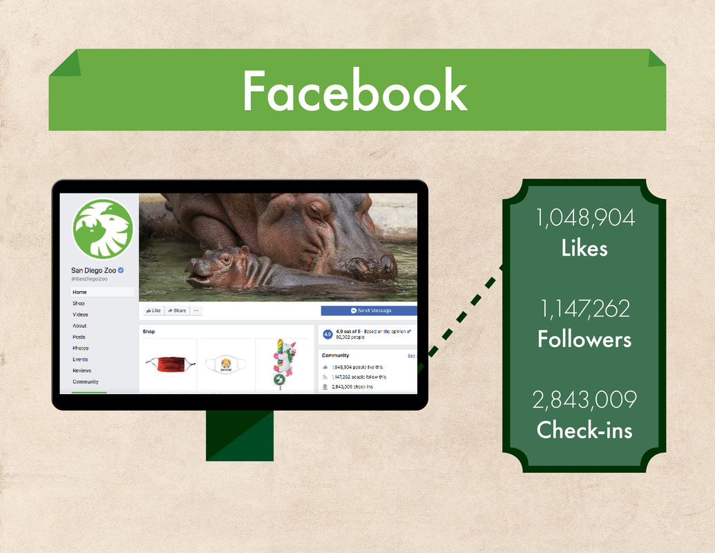
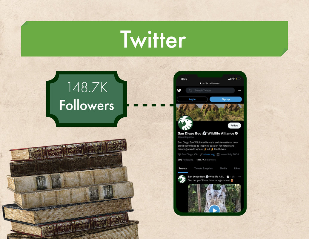
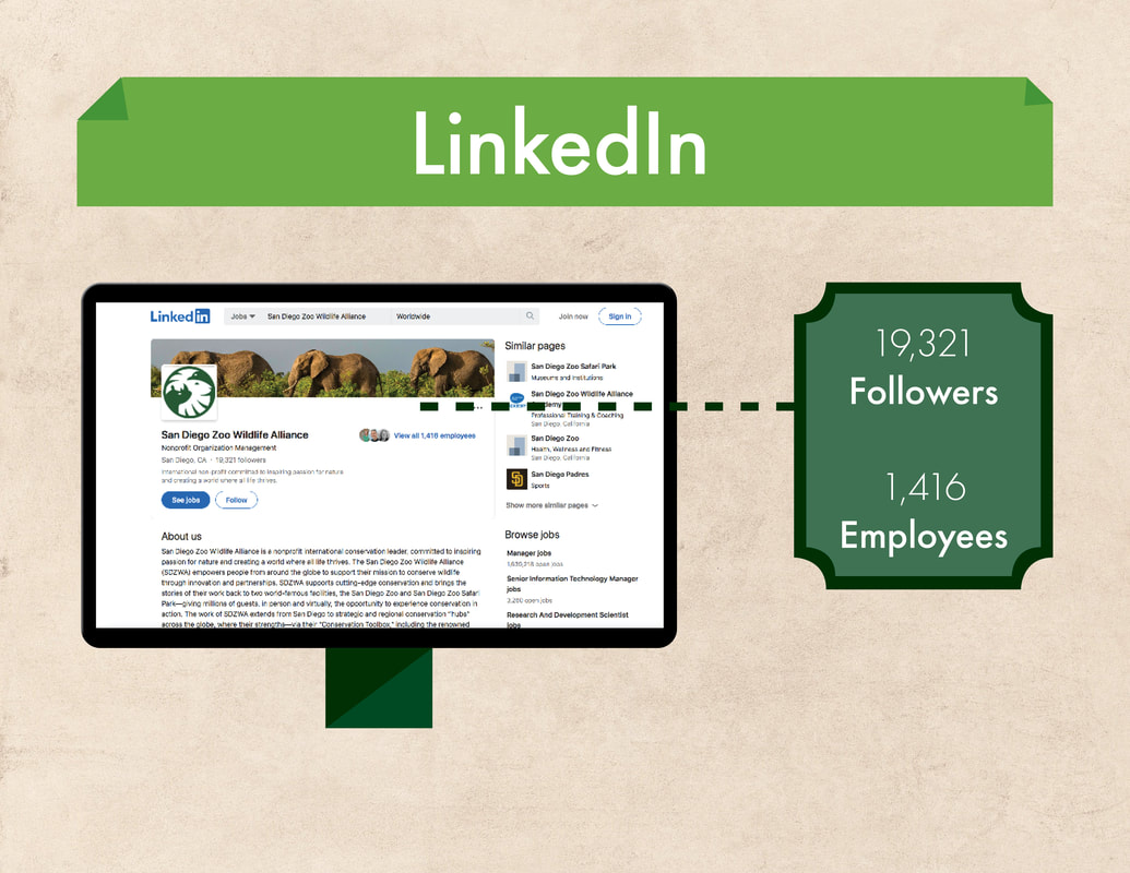
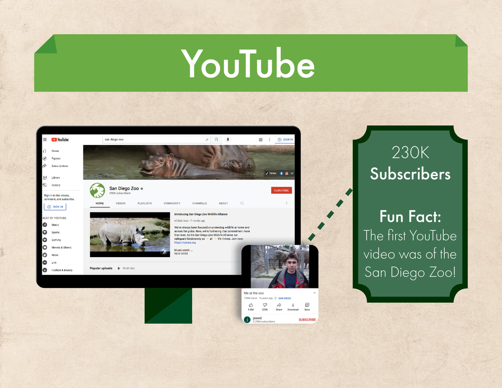
This a competitor presentation to The Living Desert. All images belong to the San Diego Zoo.


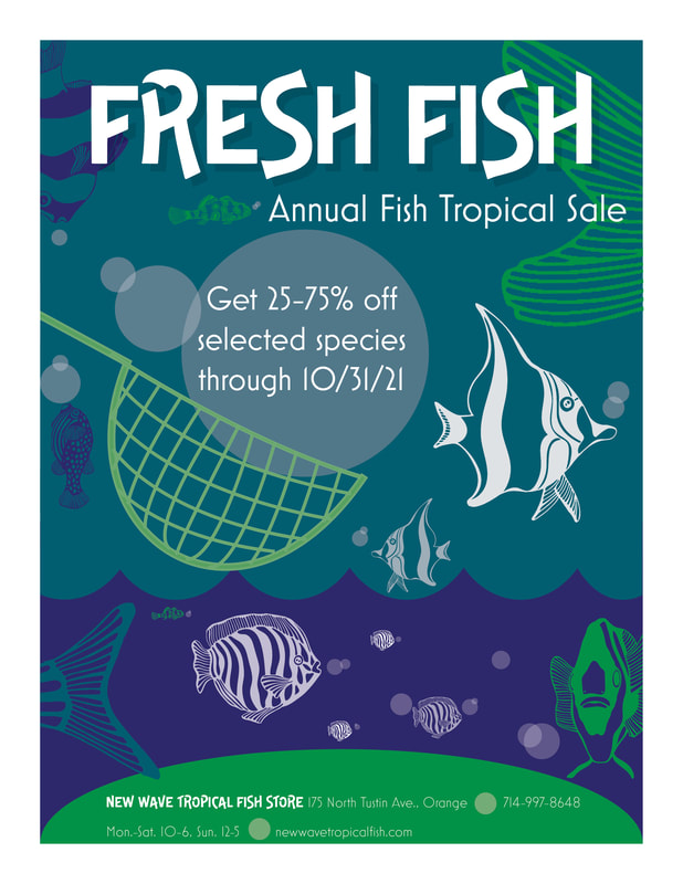
Fresh Fish Flyer
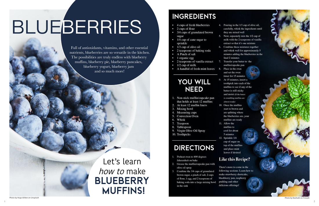
Magazine Spread
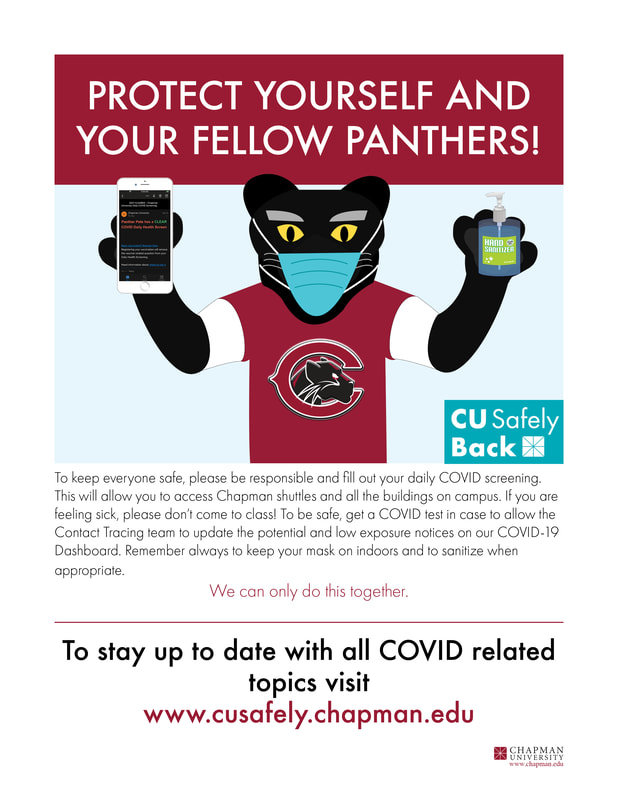
Chapman University Advertisement
Disney Inspired Graphics
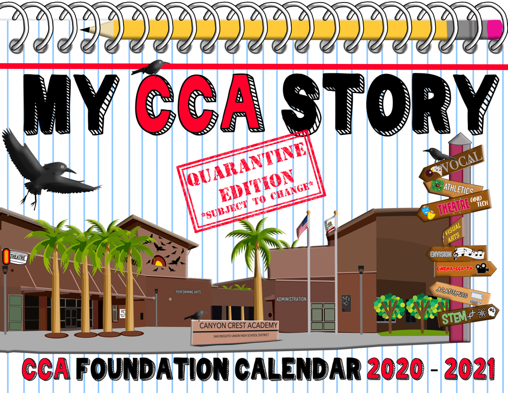
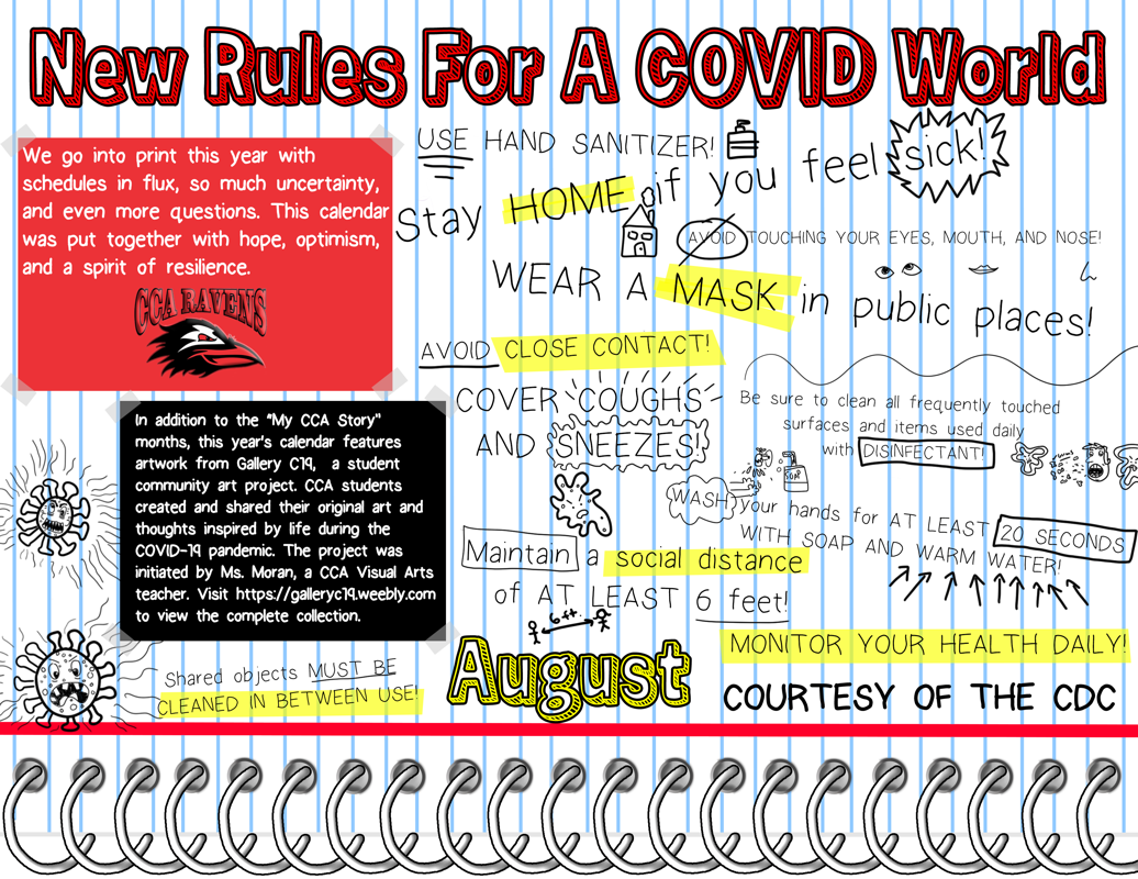
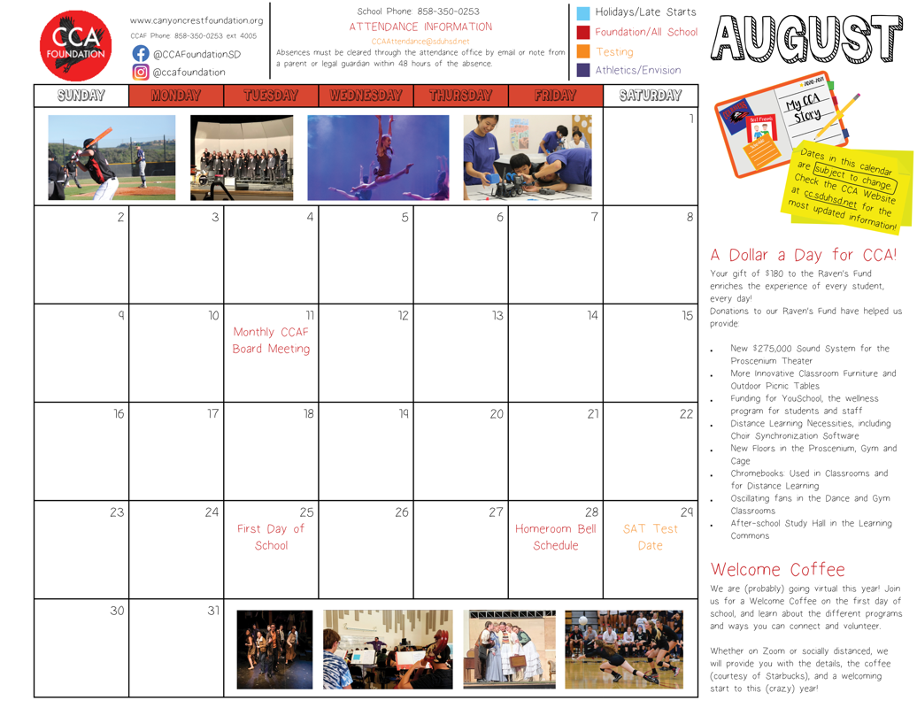
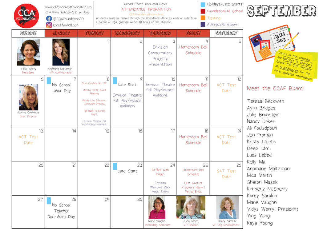
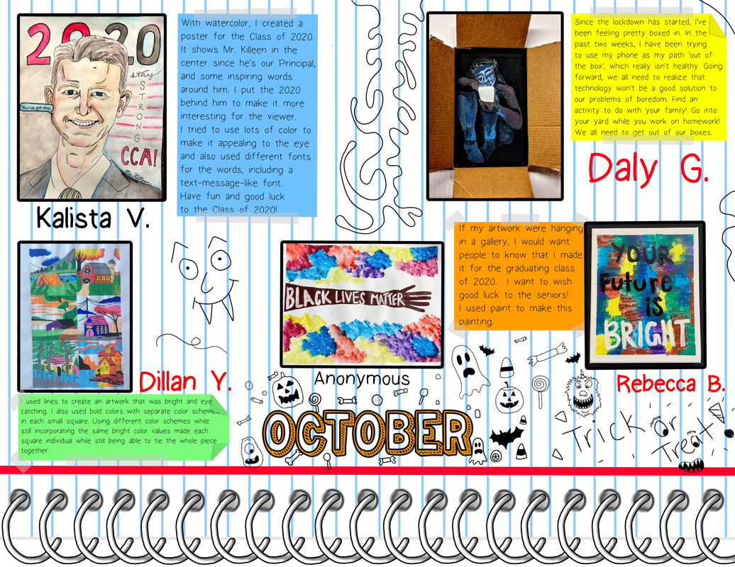
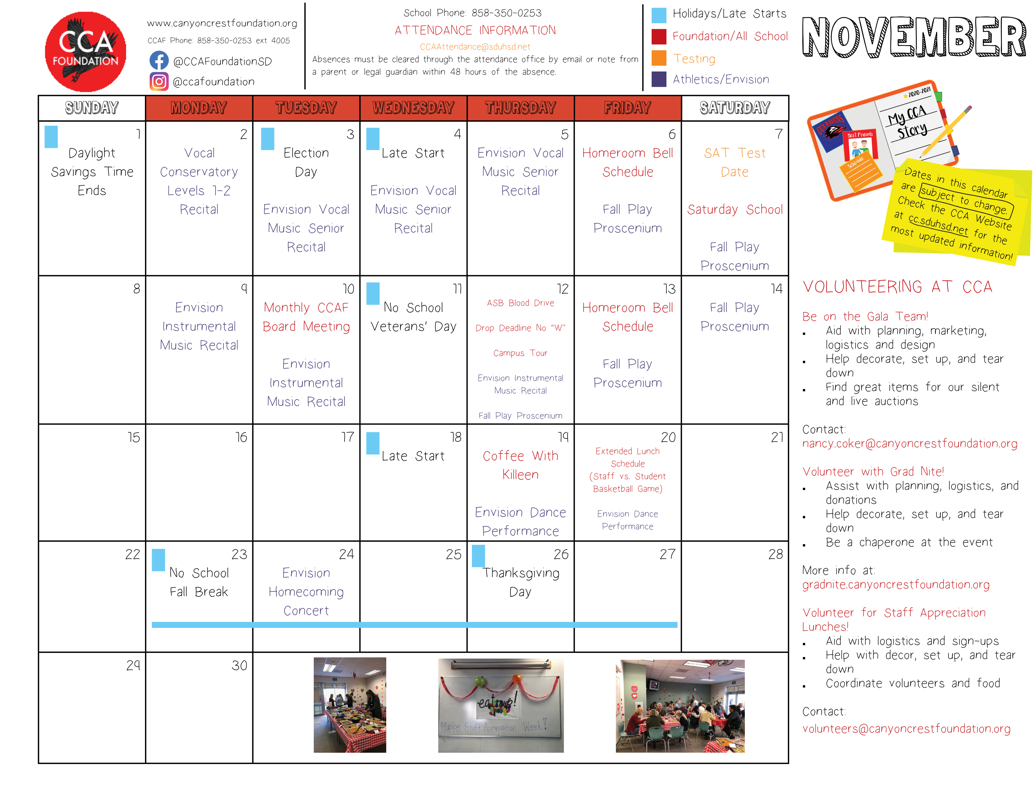
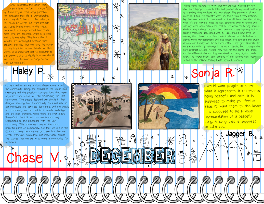
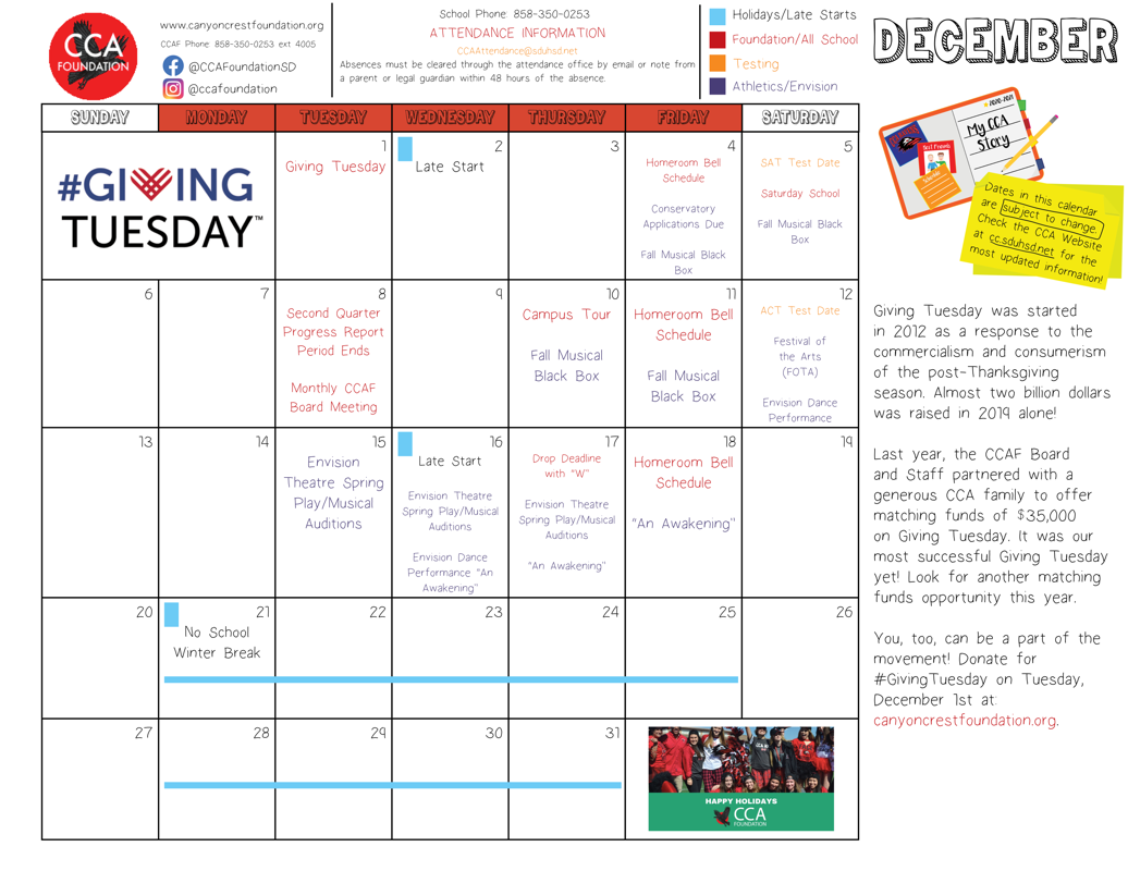
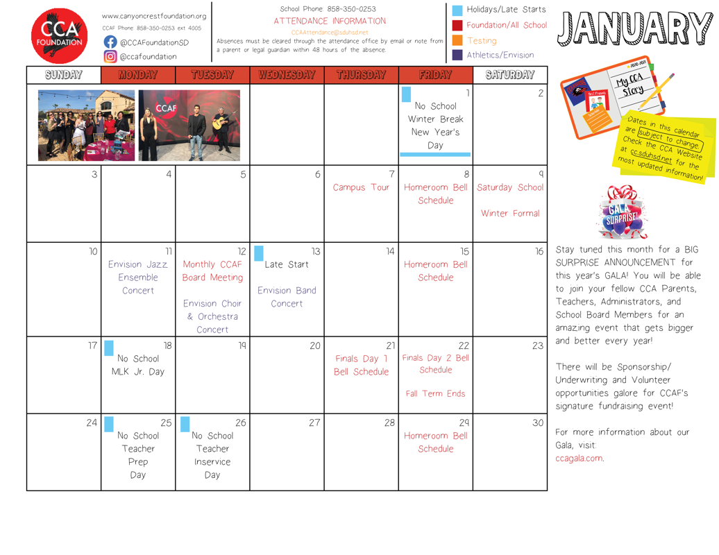
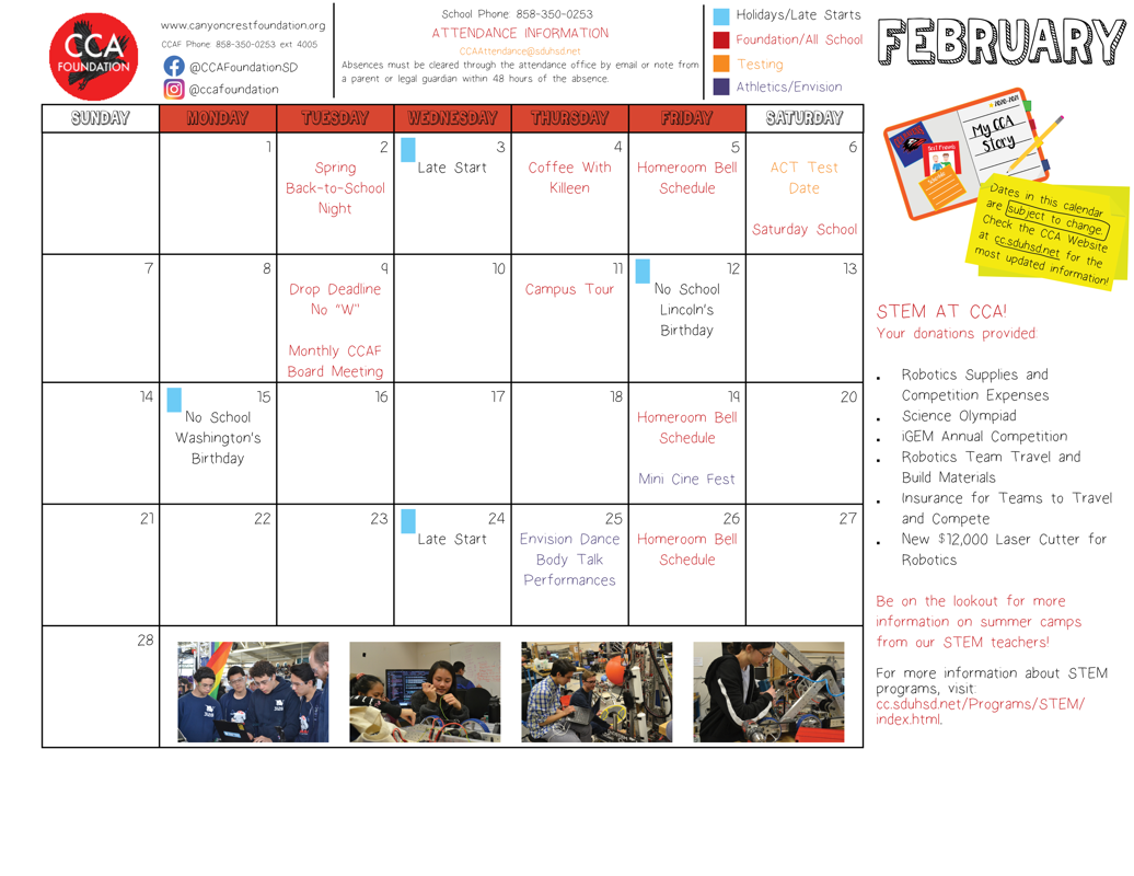
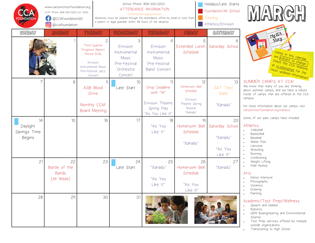
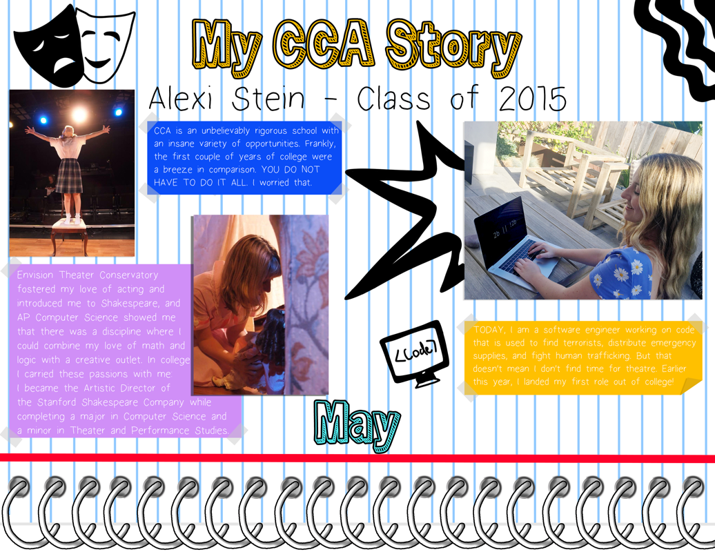
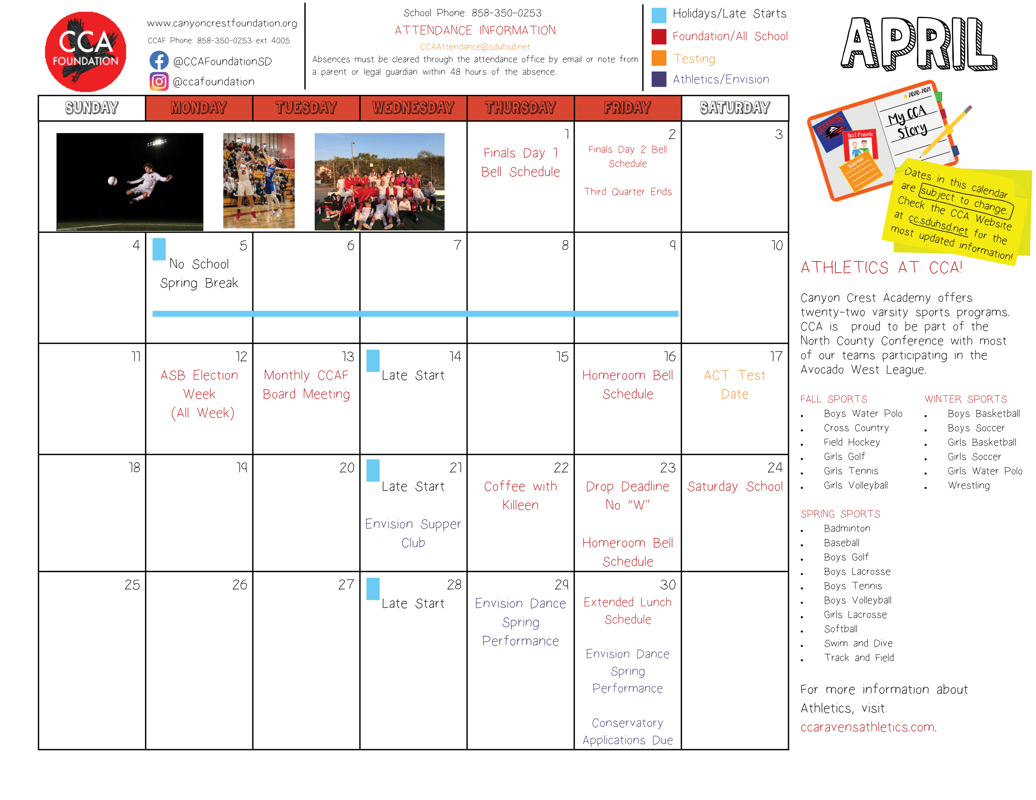
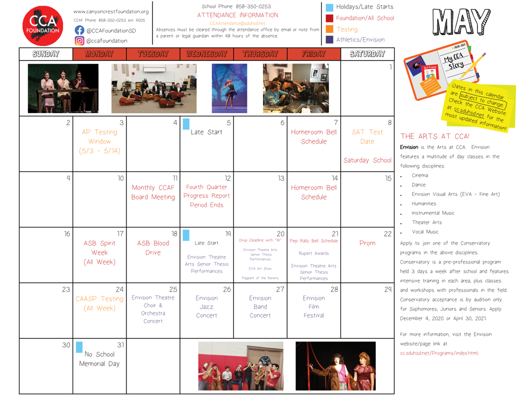
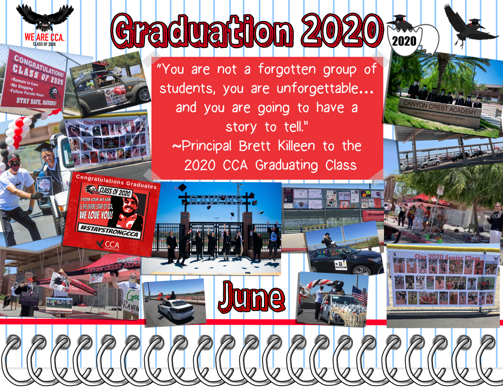
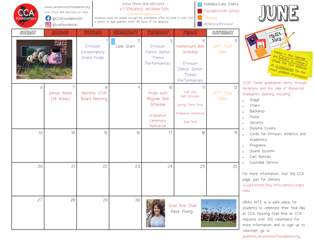
Canyon Crest Academy Foundation Calendar 2020-2021


ADVANCED DIGITAL ART & DESIGN PORTFOLIO
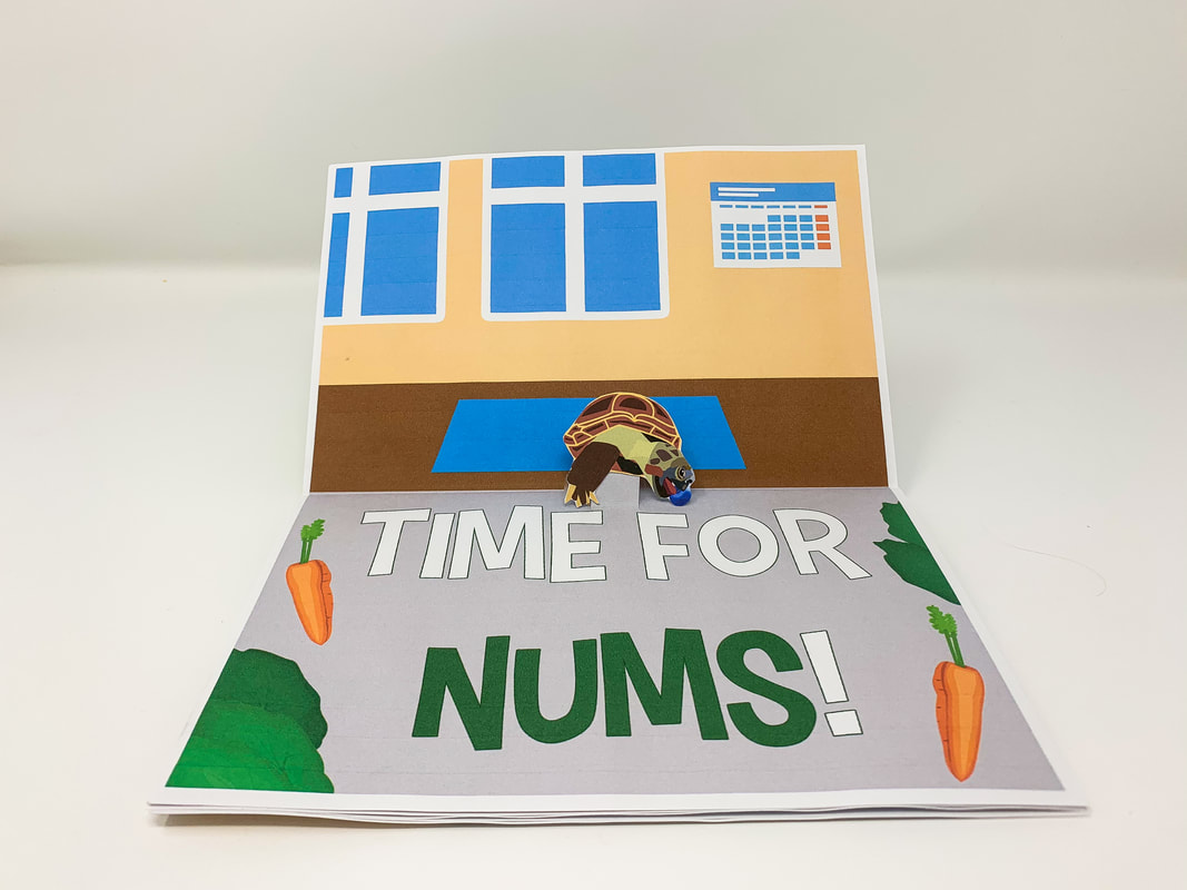
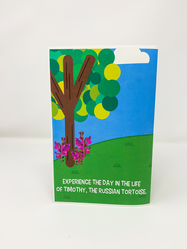
A Day in the Life of Timothy Book
|
|
       |
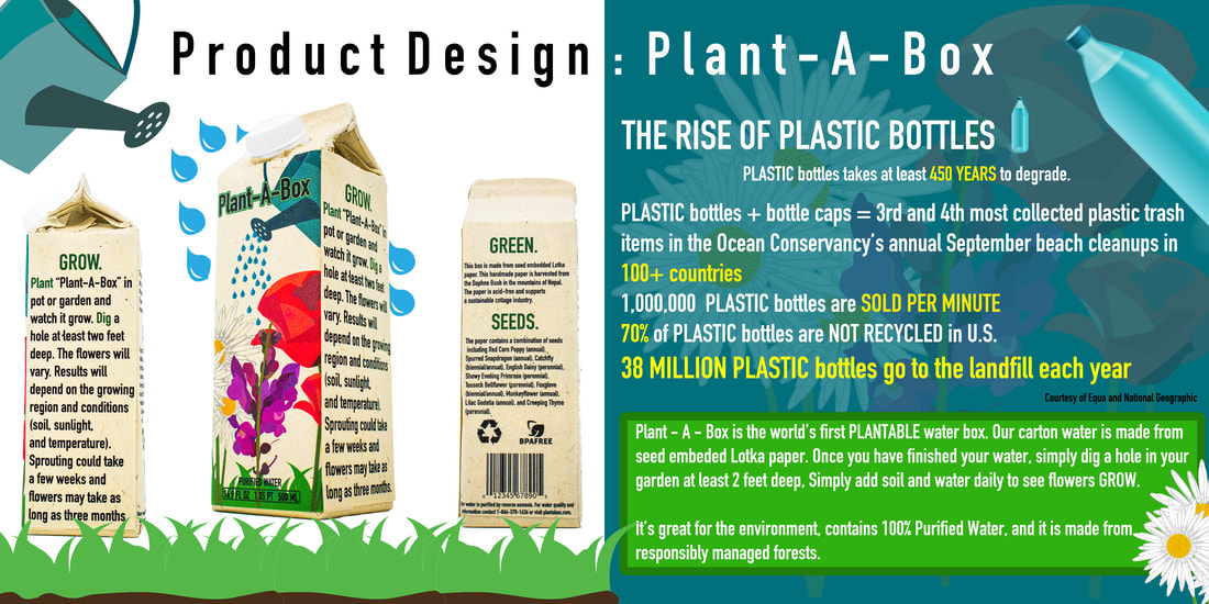
Plant-A-Box
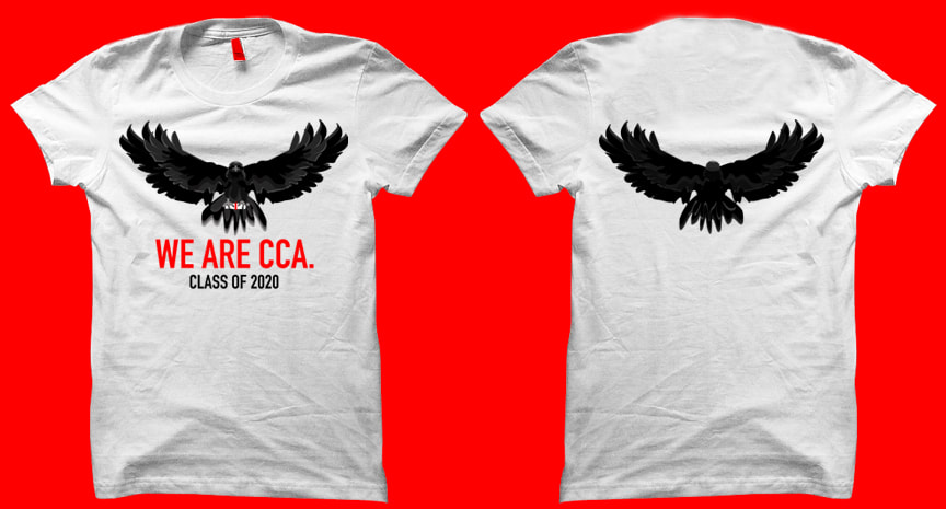
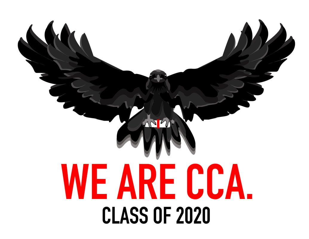
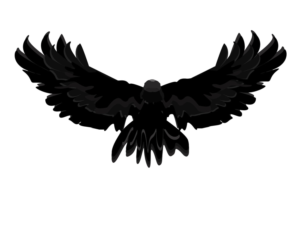
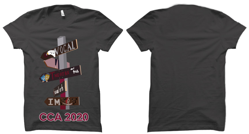
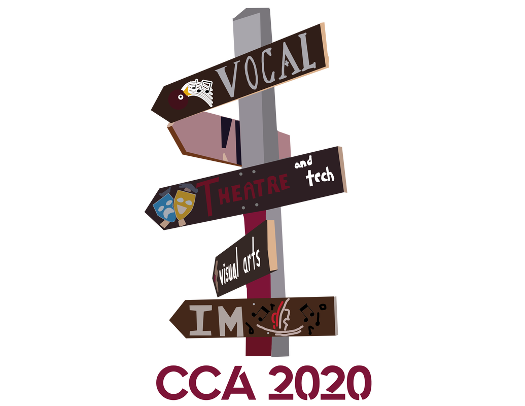
CCA Class of 2020 Graduation T-Shirt
|
|
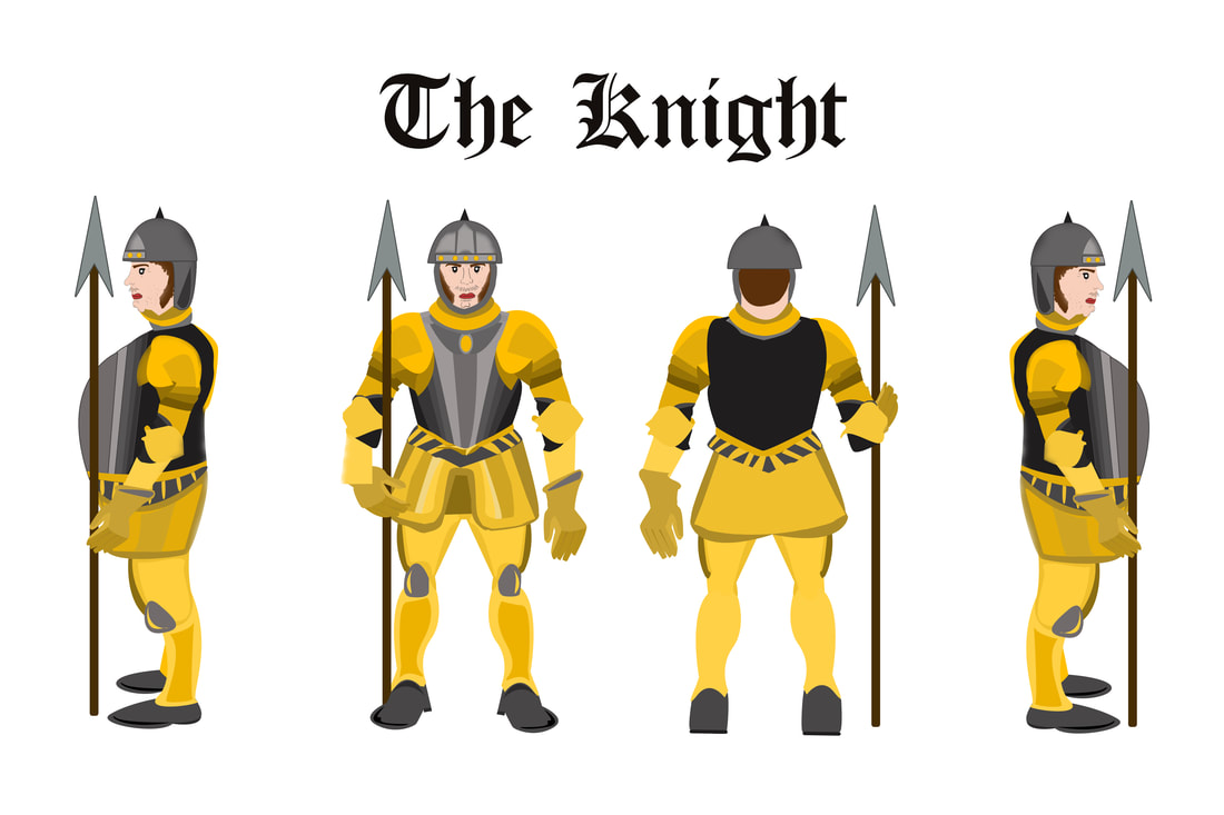
THE KNIGHT - Video Game Character Design
App for Social Good - Fiscal Fun!
Because you've always wanted to learn how to do your finances!
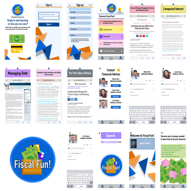
But seriously! Here at Fiscal Fun! we believe in educating young, intuitive minds on all things finance! Ever wanted to learn how to do your taxes? Or how to plan for the future? We know adulting is hard. We're just trying to make it a little easier.
CCA Graduation Pamphlet Cover Design
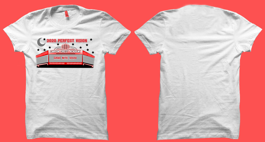
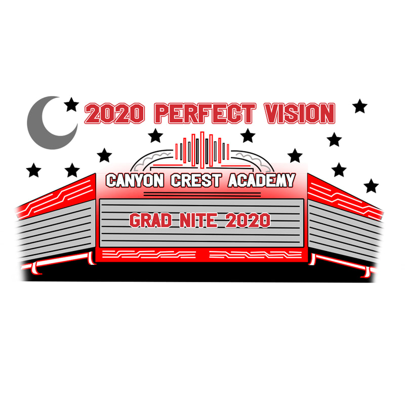
CCA Grad-Nite T-Shirt Design
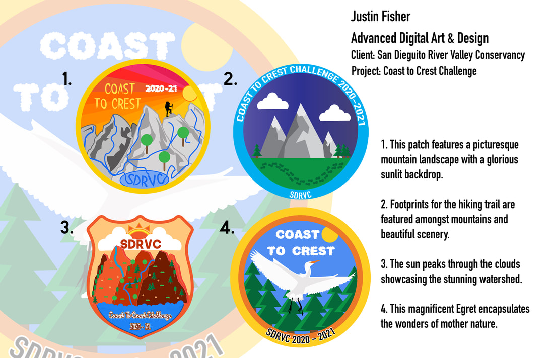
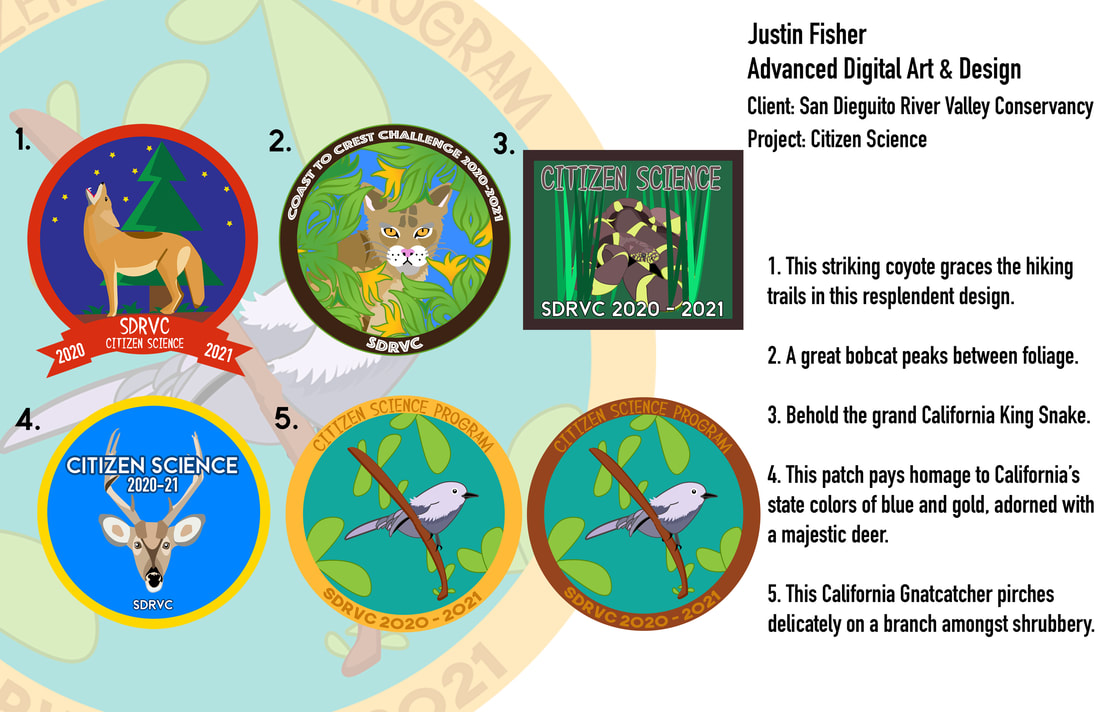
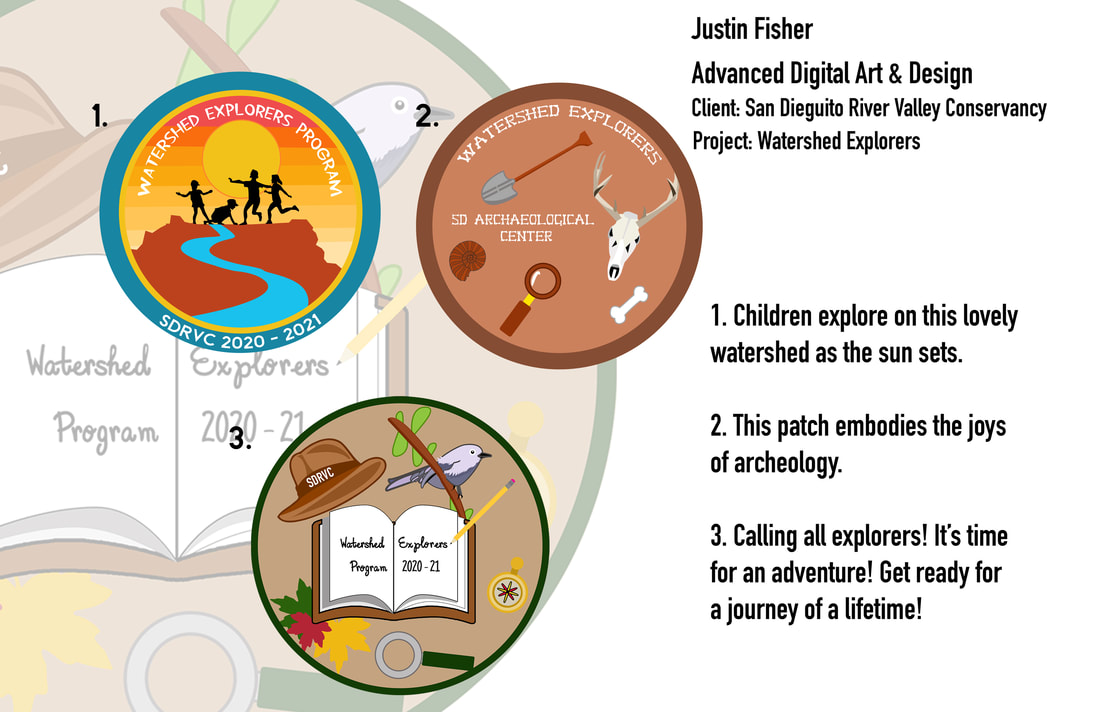
San Dieguito River Valley Conservancy Patches
2019-20 Ravens Media Guide - Men's Basketball
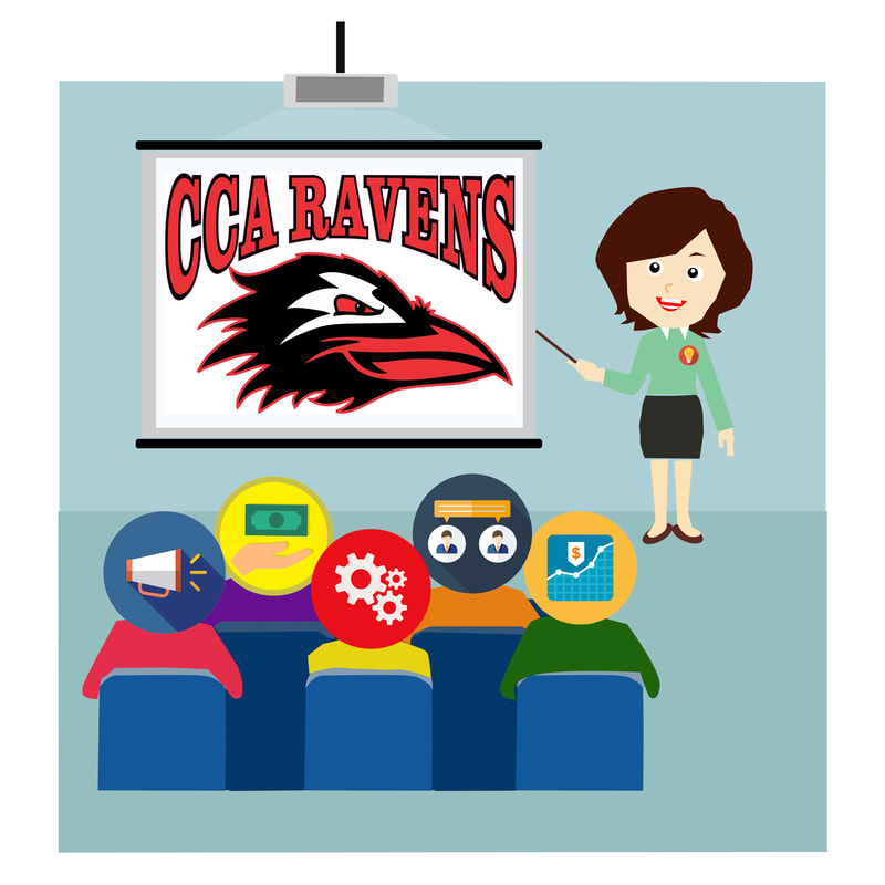
CCA Ravens Athletics Fundraising Website
Click the image below to see the CCA Ravens Athletics Fundraising Website I created.
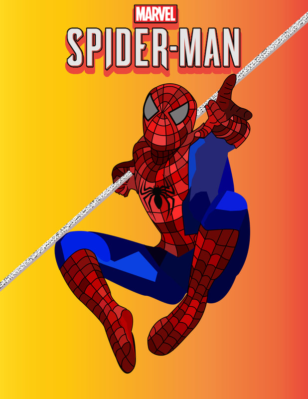
SPIDER-MAN
Garden

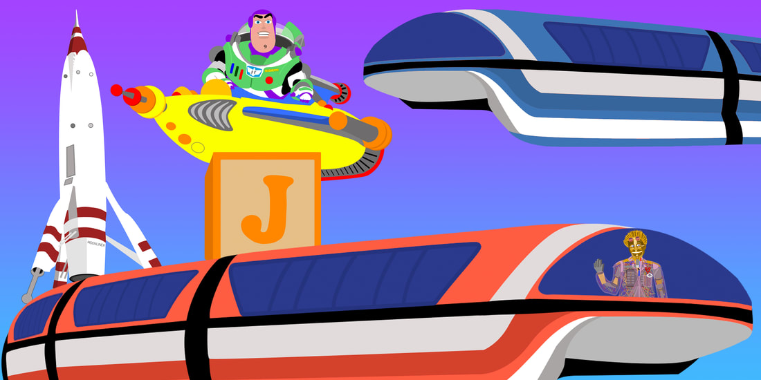
PEOPLEMOVER
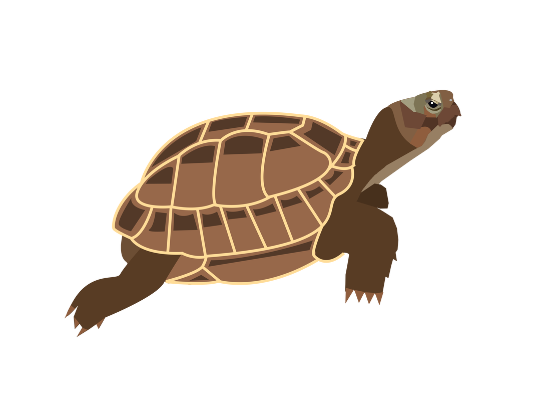
Timothy the Russian Tortoise
Gingerbread Man

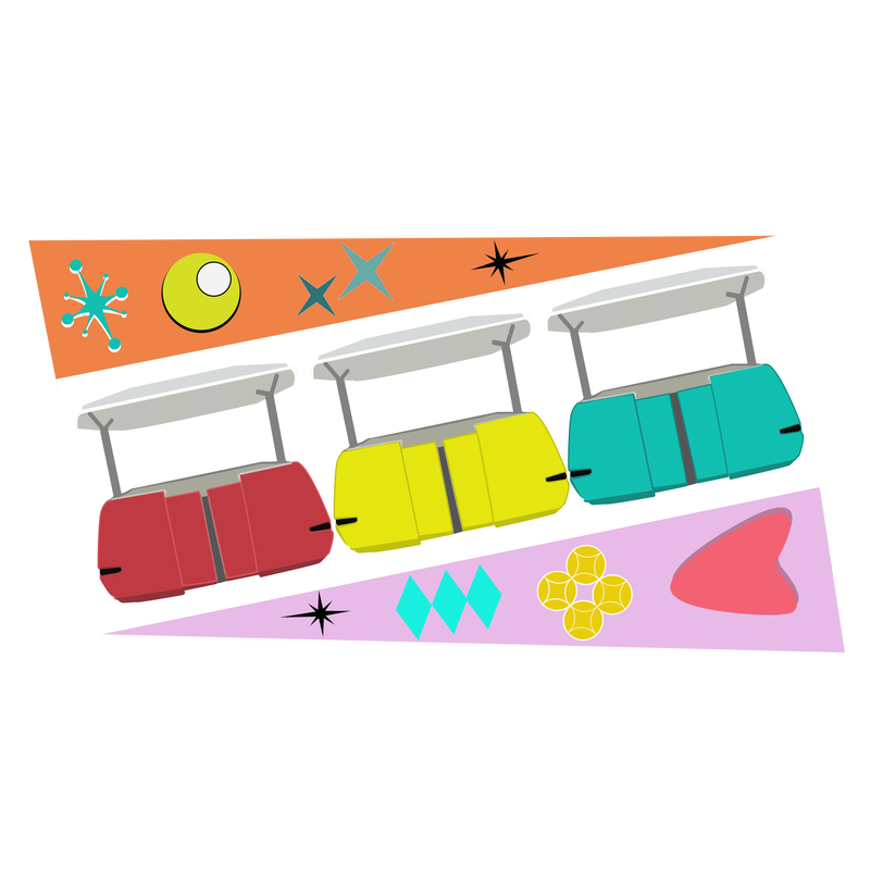
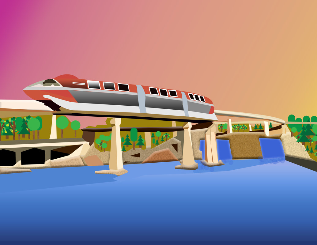
The Disneyland Monorail
CCA Senior T-Shirt Contest
|
|
CCA CTE Business Pathway Website
Click the image below to see the CCA CTE Business Website I created.
This is the current website used by the Canyon Crest Academy Business Classes.
This is the current website used by the Canyon Crest Academy Business Classes.
DIGITAL ART & DESIGN PORTFOLIO
Alternate Movie Poster Project
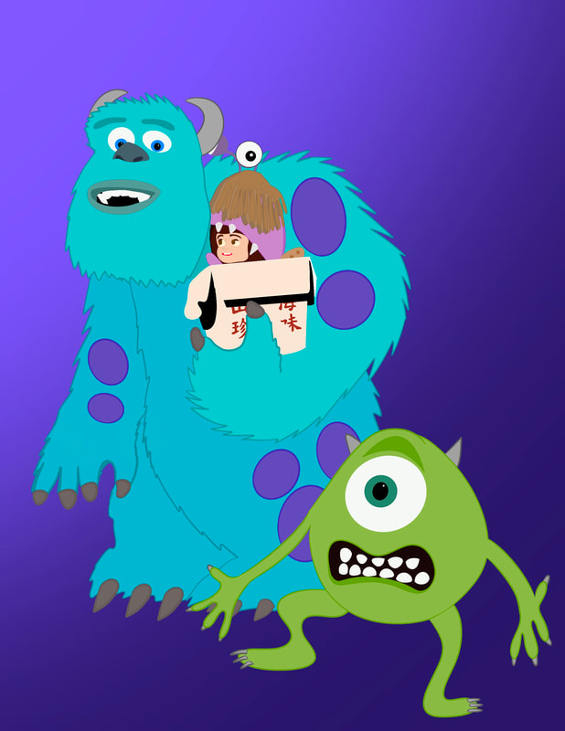
Monsters Inc. Movie Poster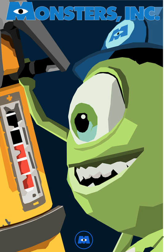
|
Bohemian Rhapsody Movie Poster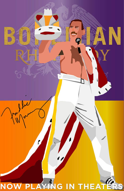
|
Shrek Movie Poster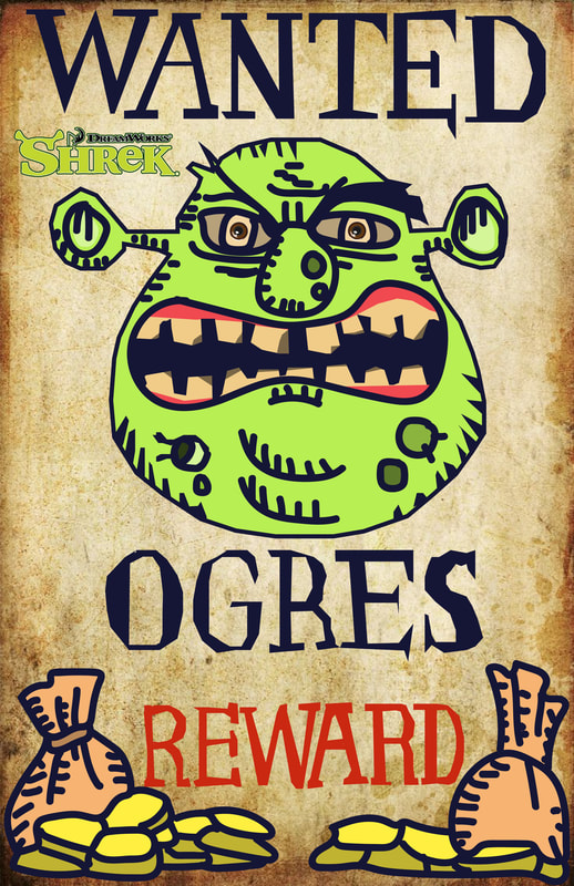
|
Spongebob Squarepants TV Poster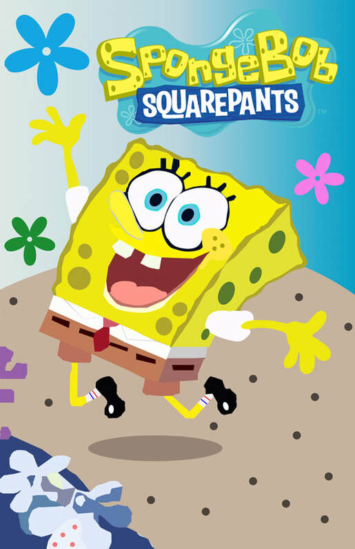
|
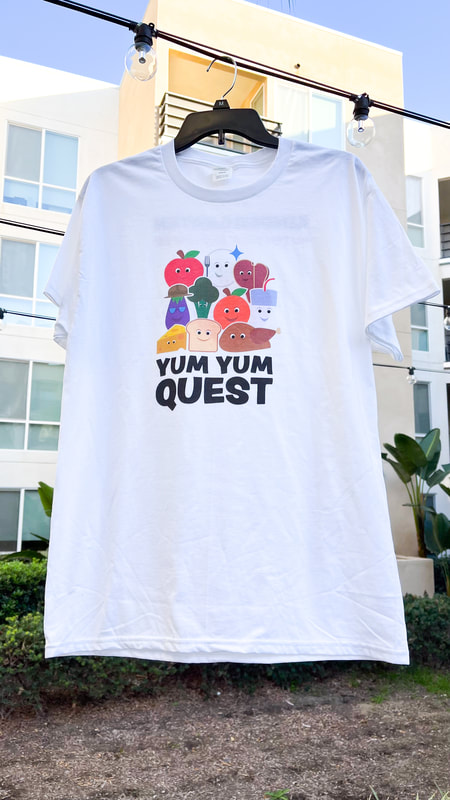
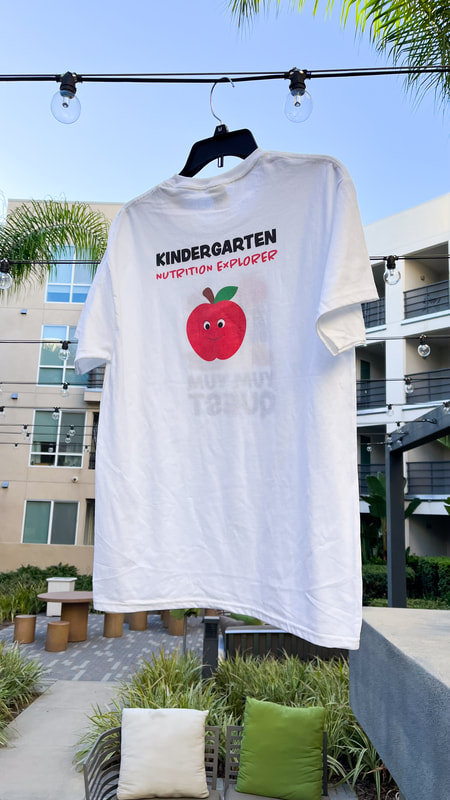
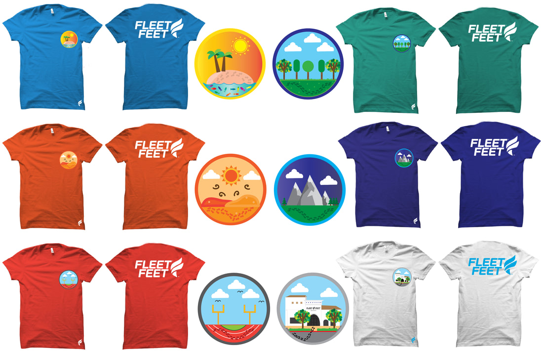
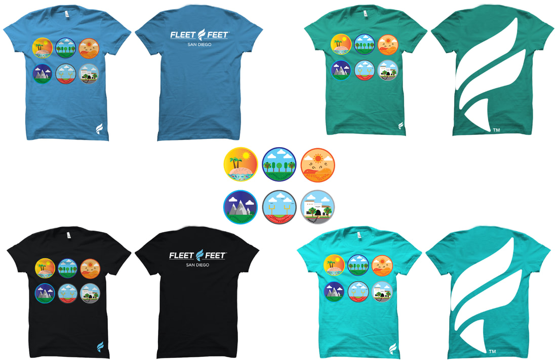
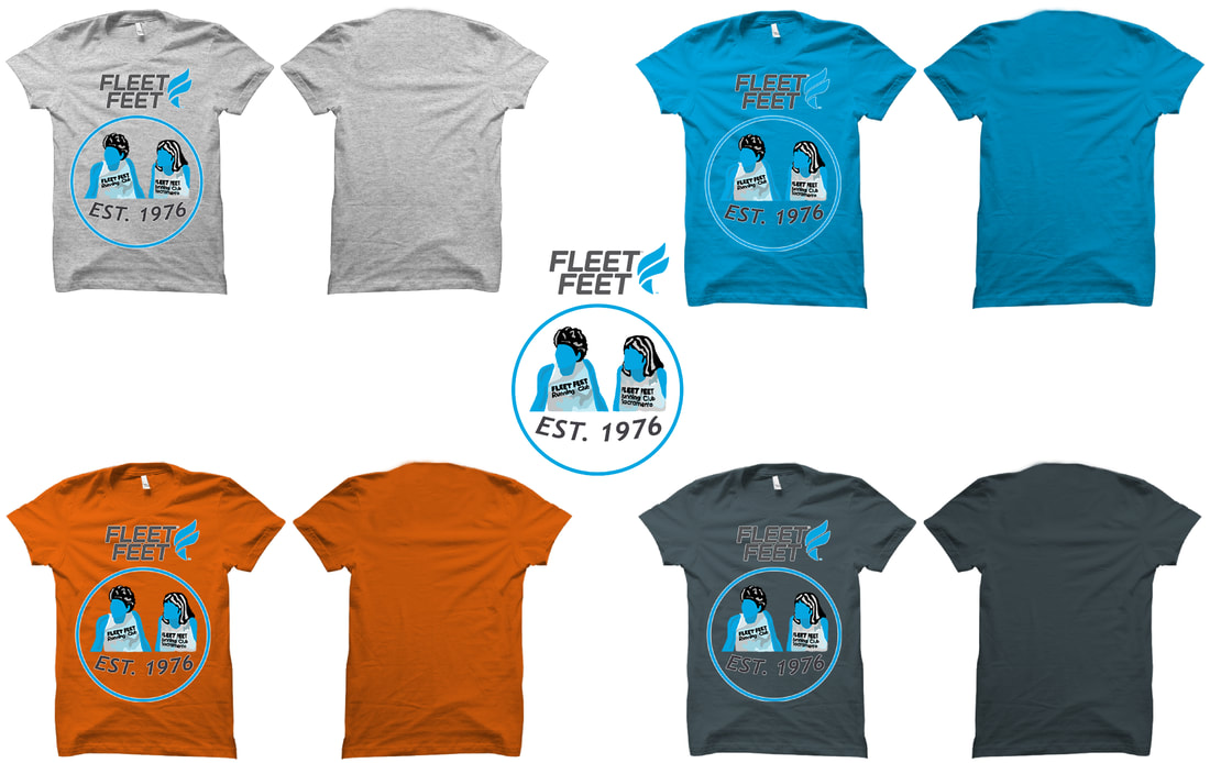
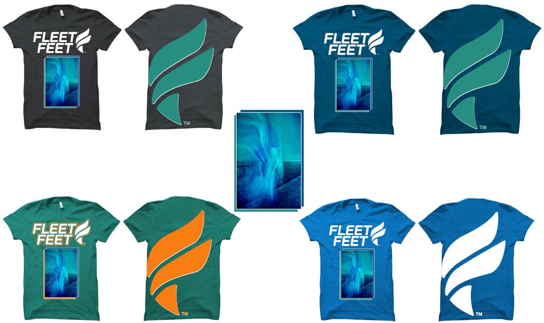
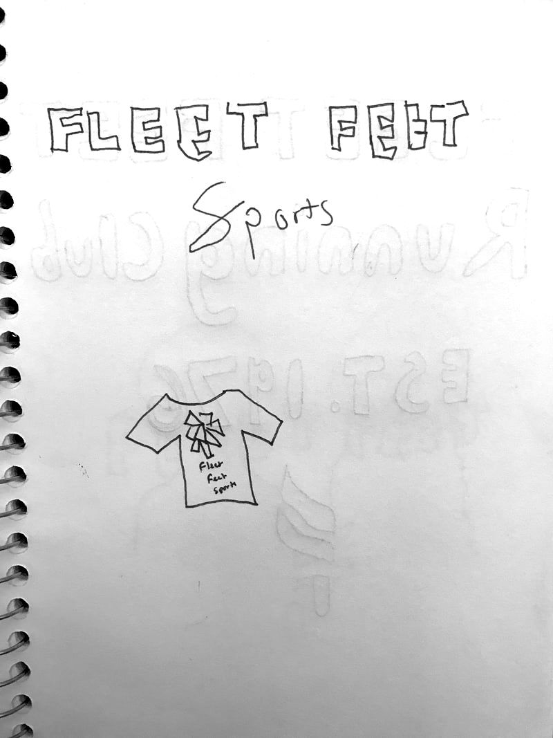
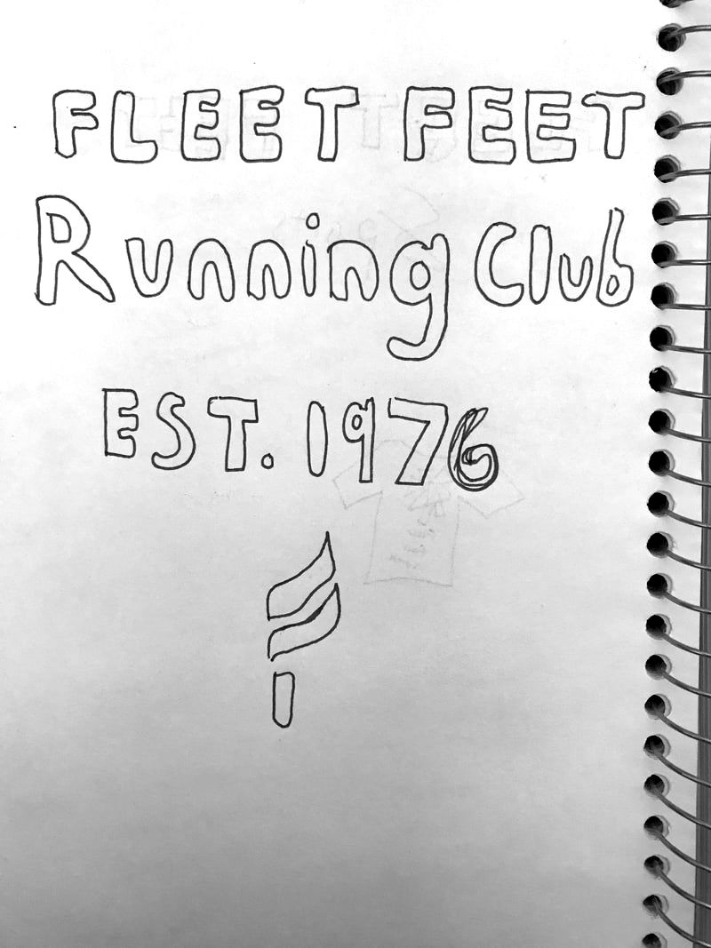
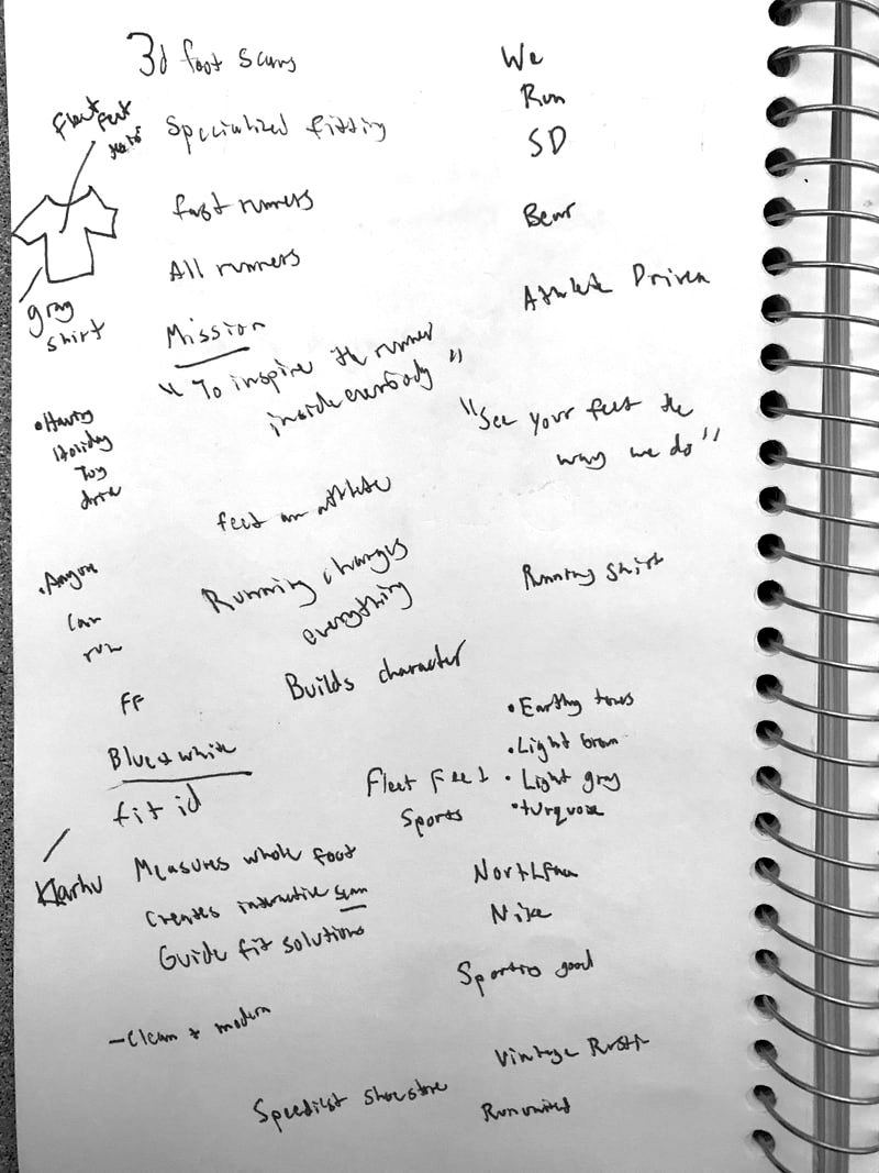
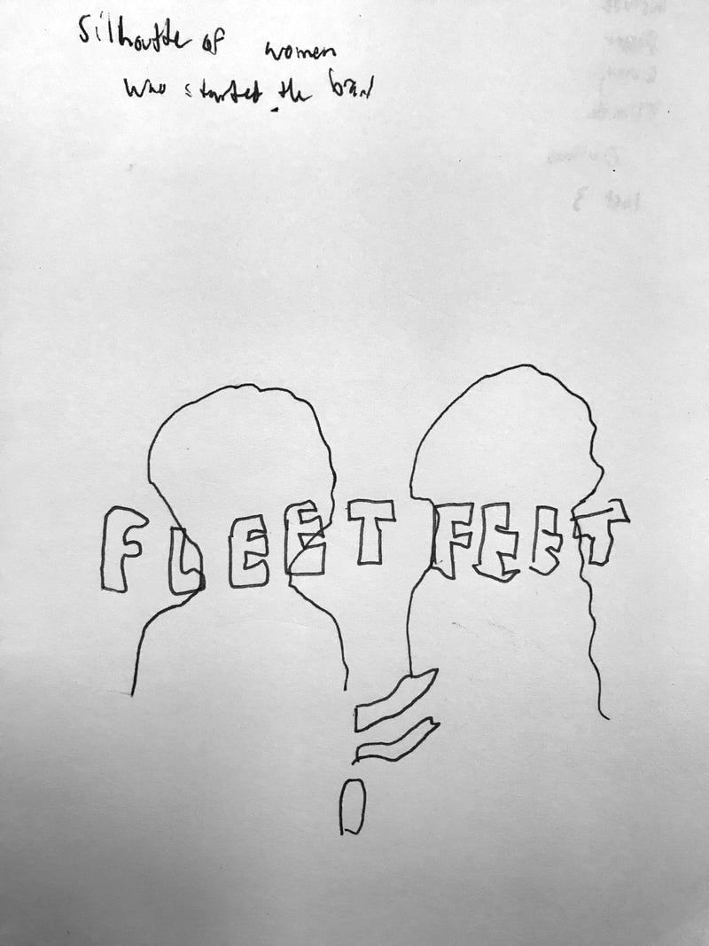
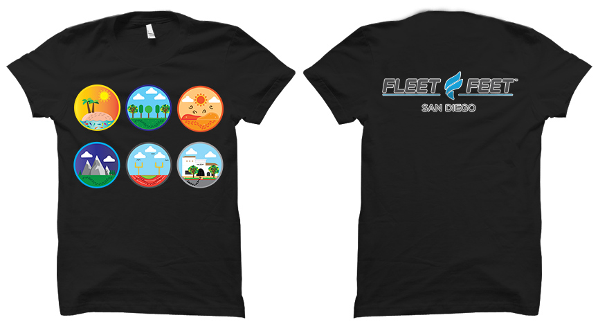
Fleet Feet T-Shirt Collaboration
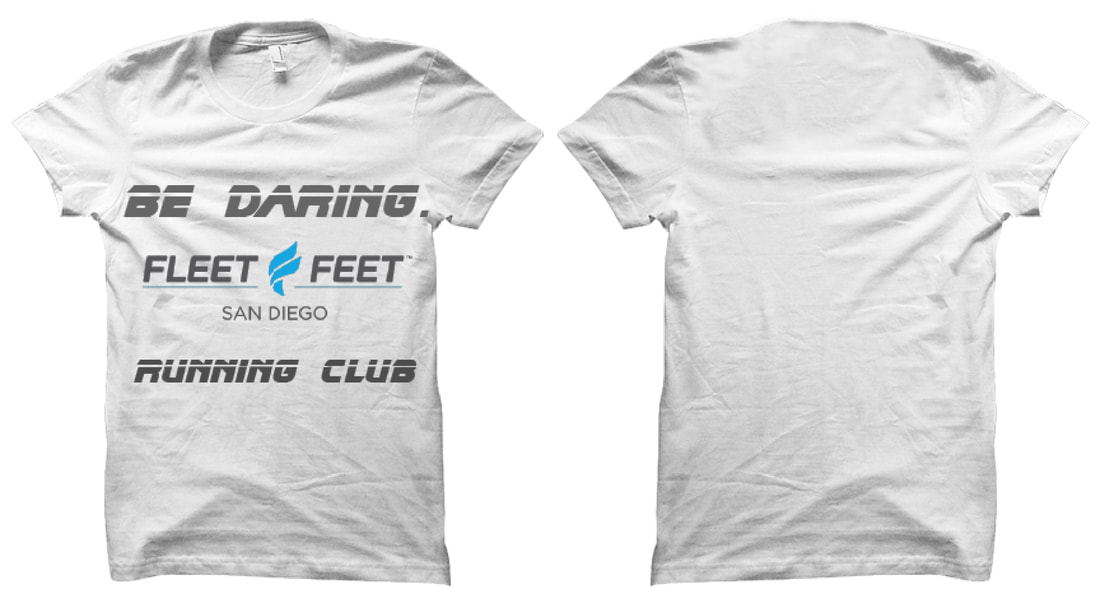
Rough Drafts
|
|
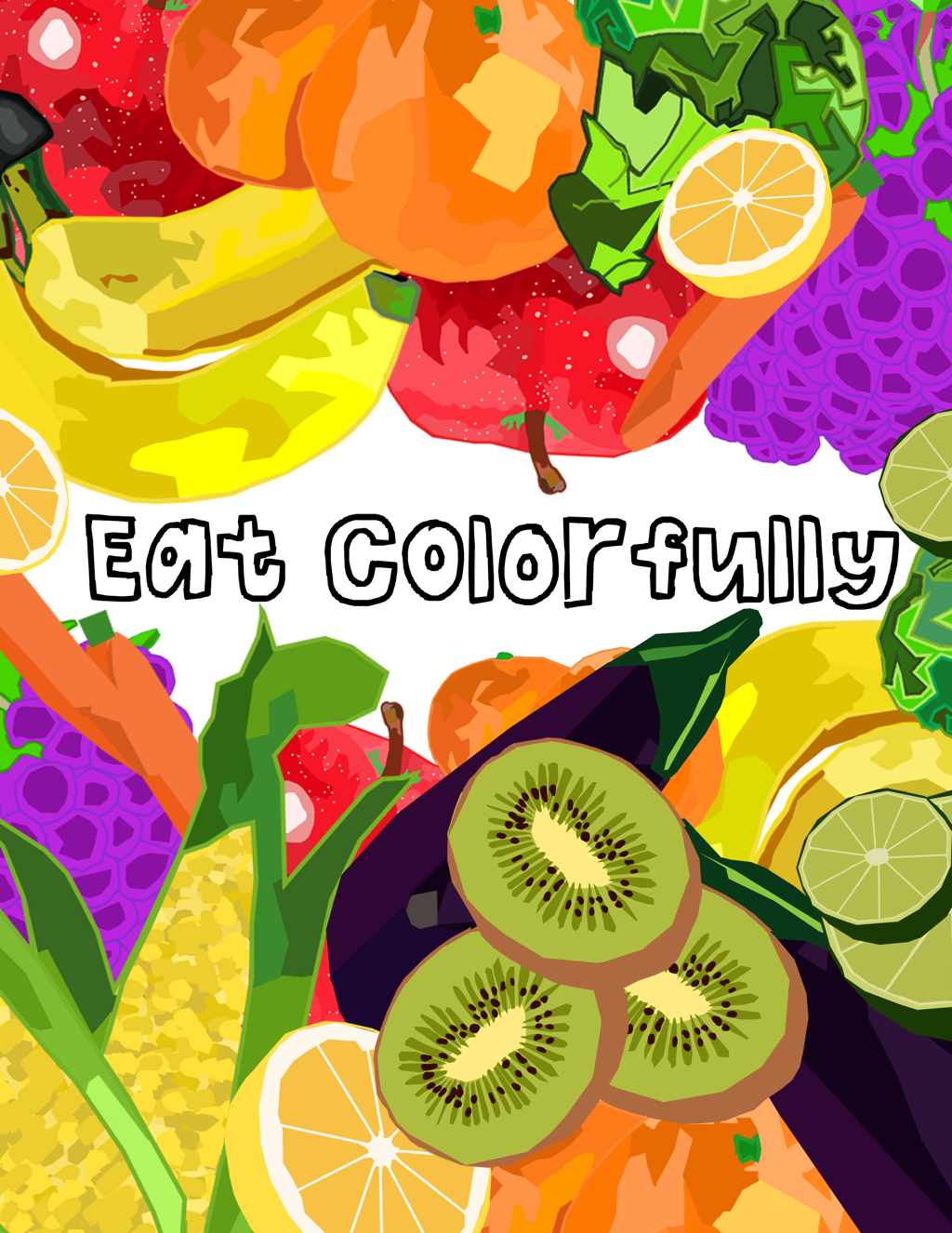
Pulse Magazine Health Artwork
Partner Logo
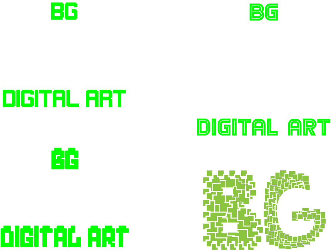
Final
Designed by Bianca Goldschmidt |
|
Drafts
1st Draft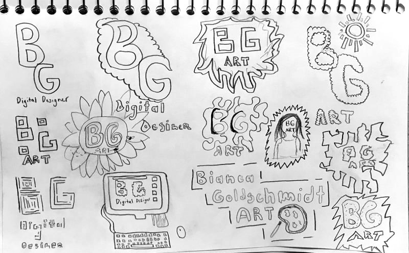
|
2nd Draft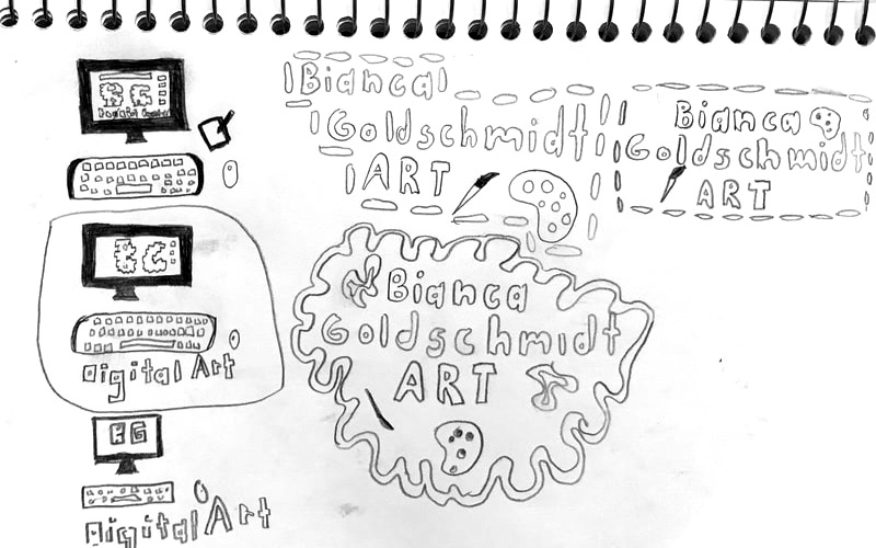
|
Font Drafts
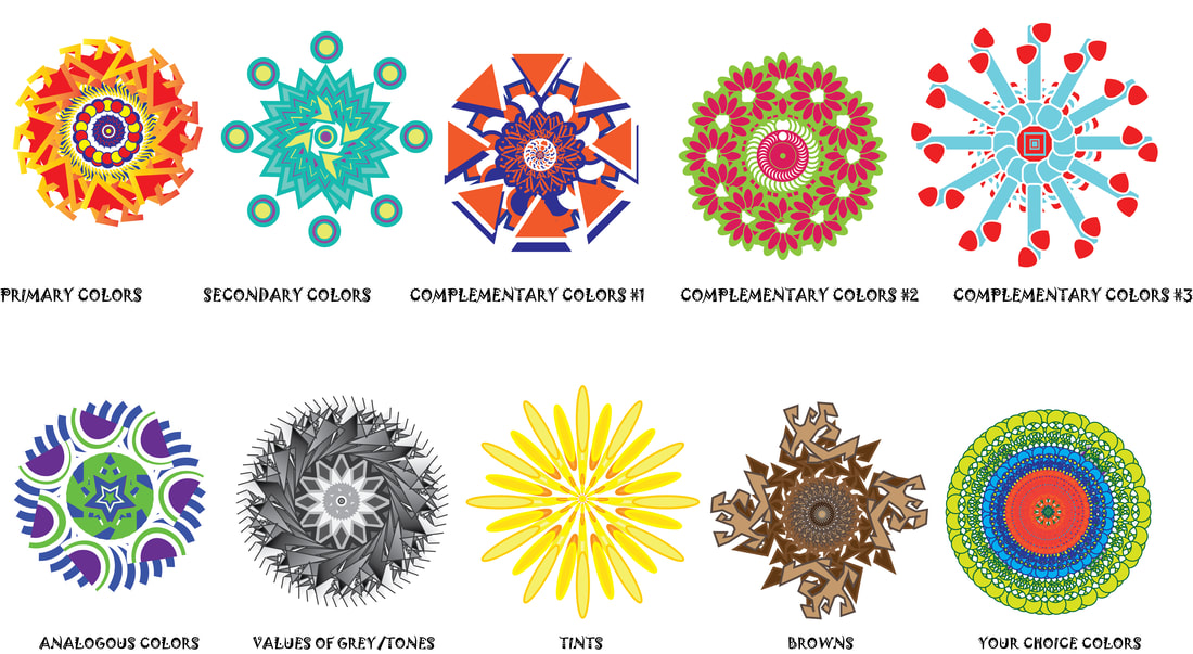
Mandalas & Color Theory
Iconography
Fantastical Portraits
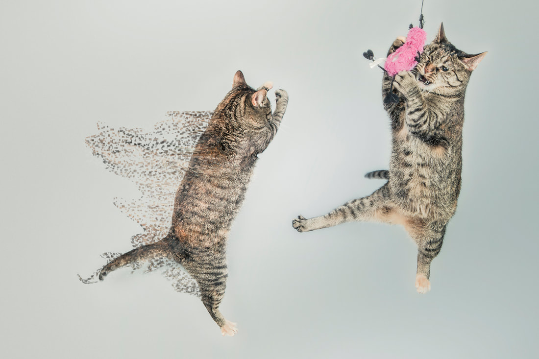
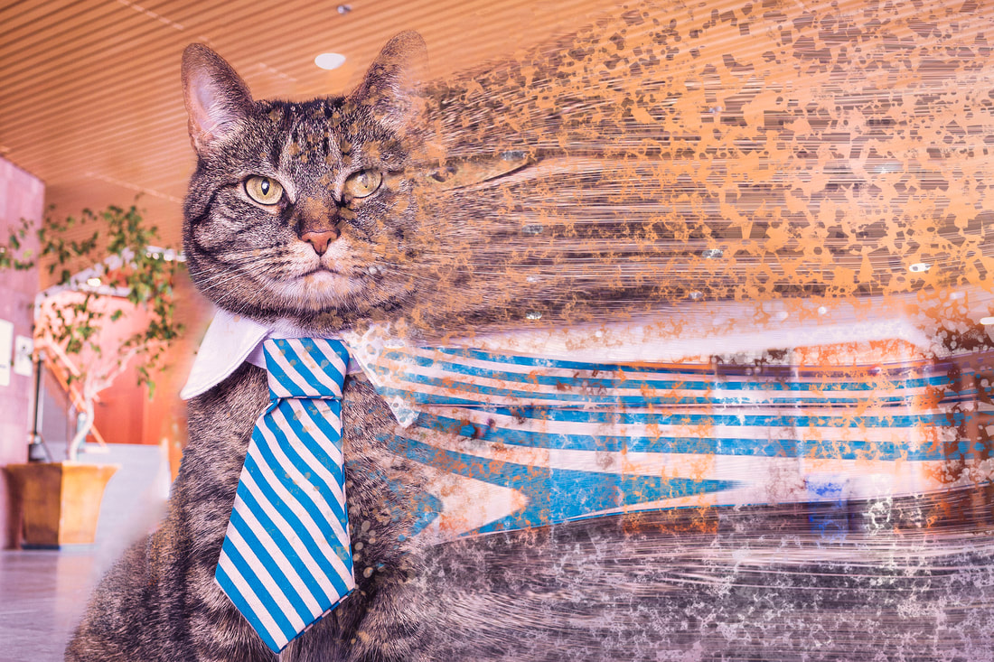
Dispersion Effect


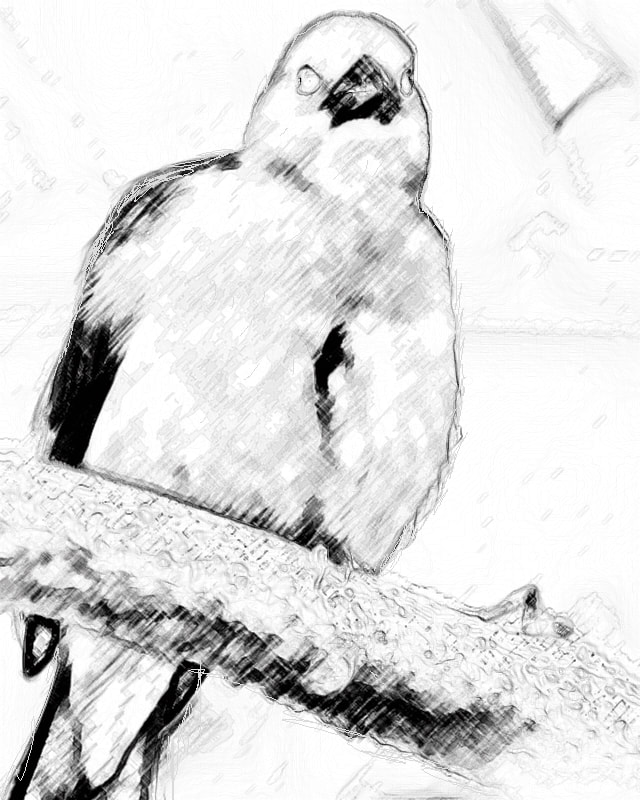
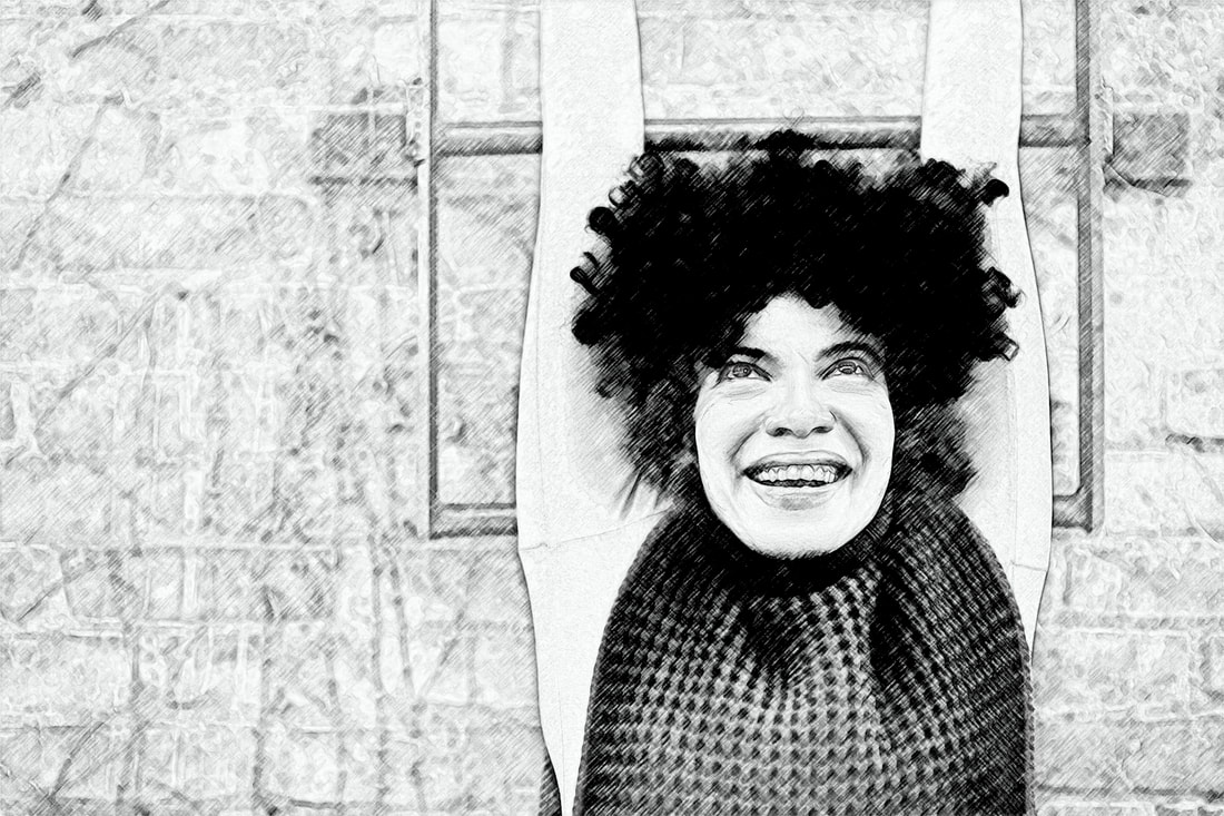
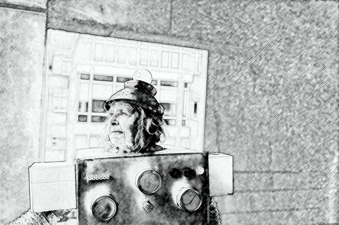
Pencil Drawing Effect

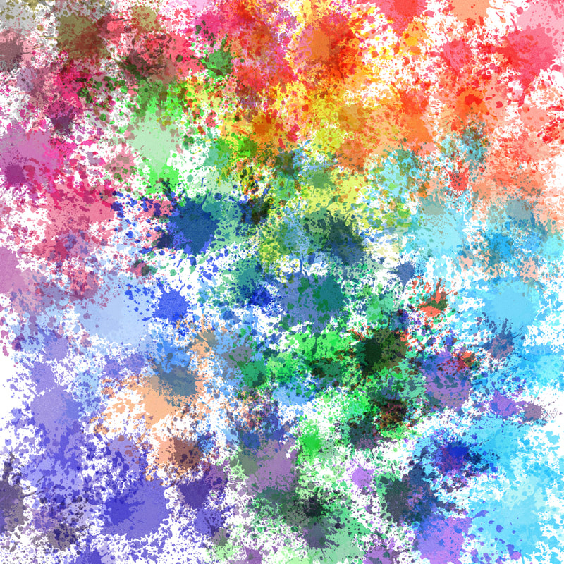
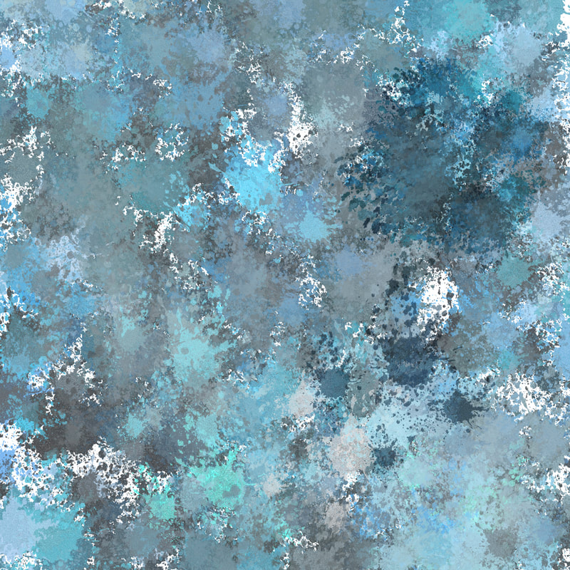
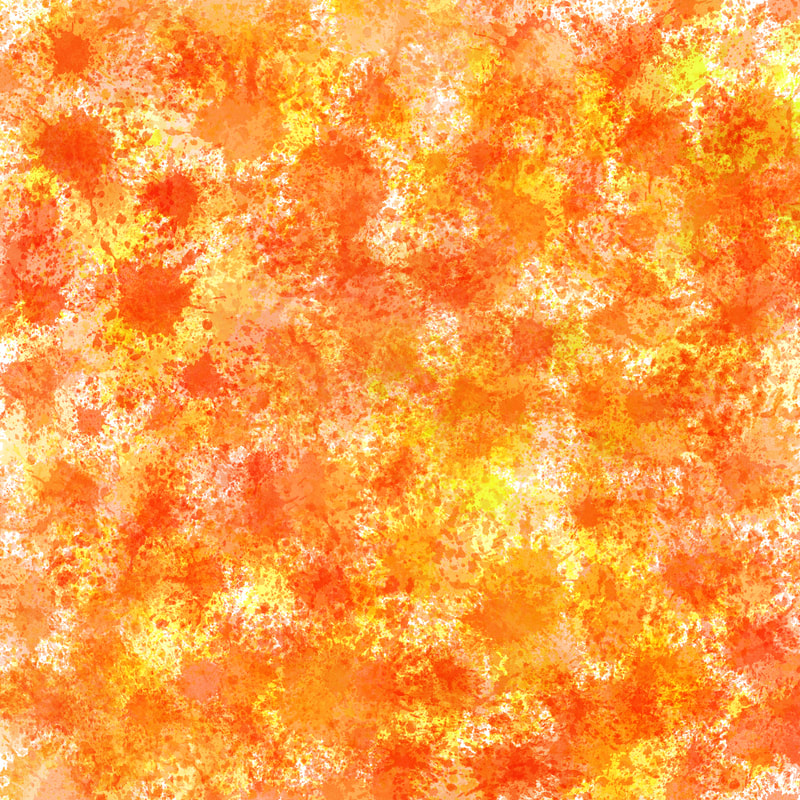
Brush Techniques - Paint Splatter


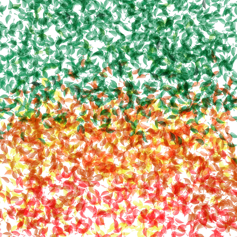
Autumn
Displacement Mapping Project
Shoe Design |
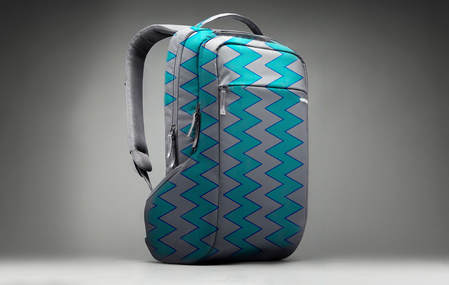
Backpack Design |
Mickey Mouse Hoodie
Mint Green Purse
Comic Book Apple Watch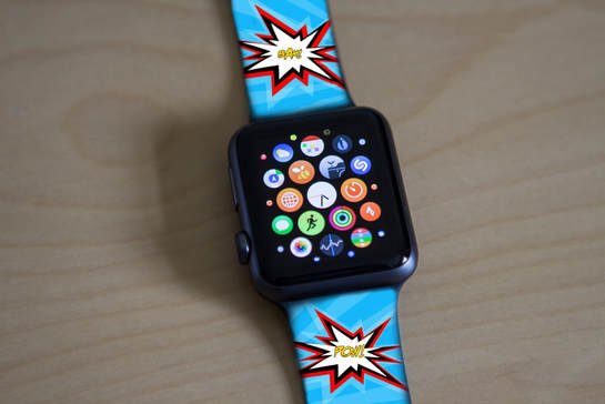
|
Dress Shirt & Suspenders
Green & Blue Wallet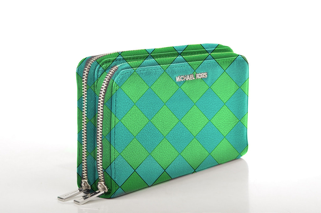
Denim Jacket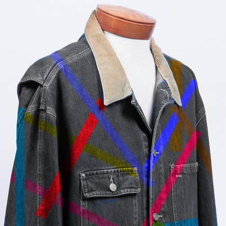
|
Animal Hybrid Project
|
|
Image #1
This new reptile features a skink head, a chameleon body, and red eye tree frog hands/feet. Image #2 This colorful bird showcases a lorikeet body, a flamingo head, owl eyes, and a chicken's comb. Image #3 This duck features a gator head, a Chinese Water Duck body, and a lemur tail. |
Fence Demo Project
|
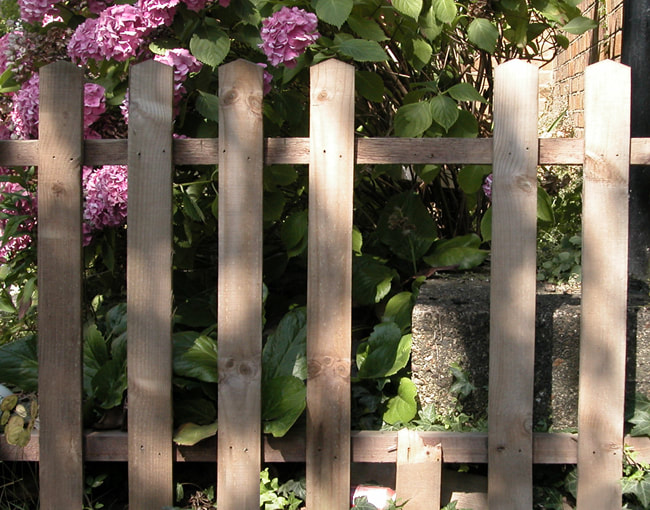
Before
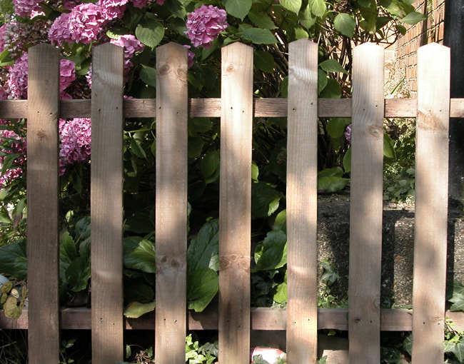
Nature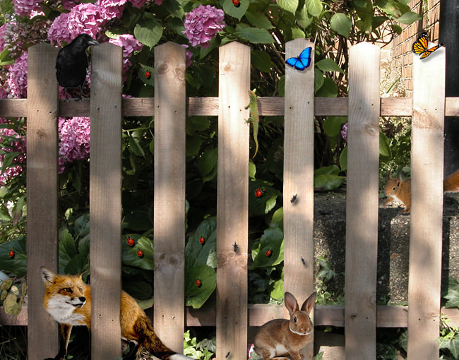
|
After
SPROUTS Advertisement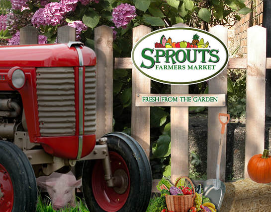
|
Abstract Shape Compositions Black and White
|
Action
|
Passive
|
Mysterious
|
